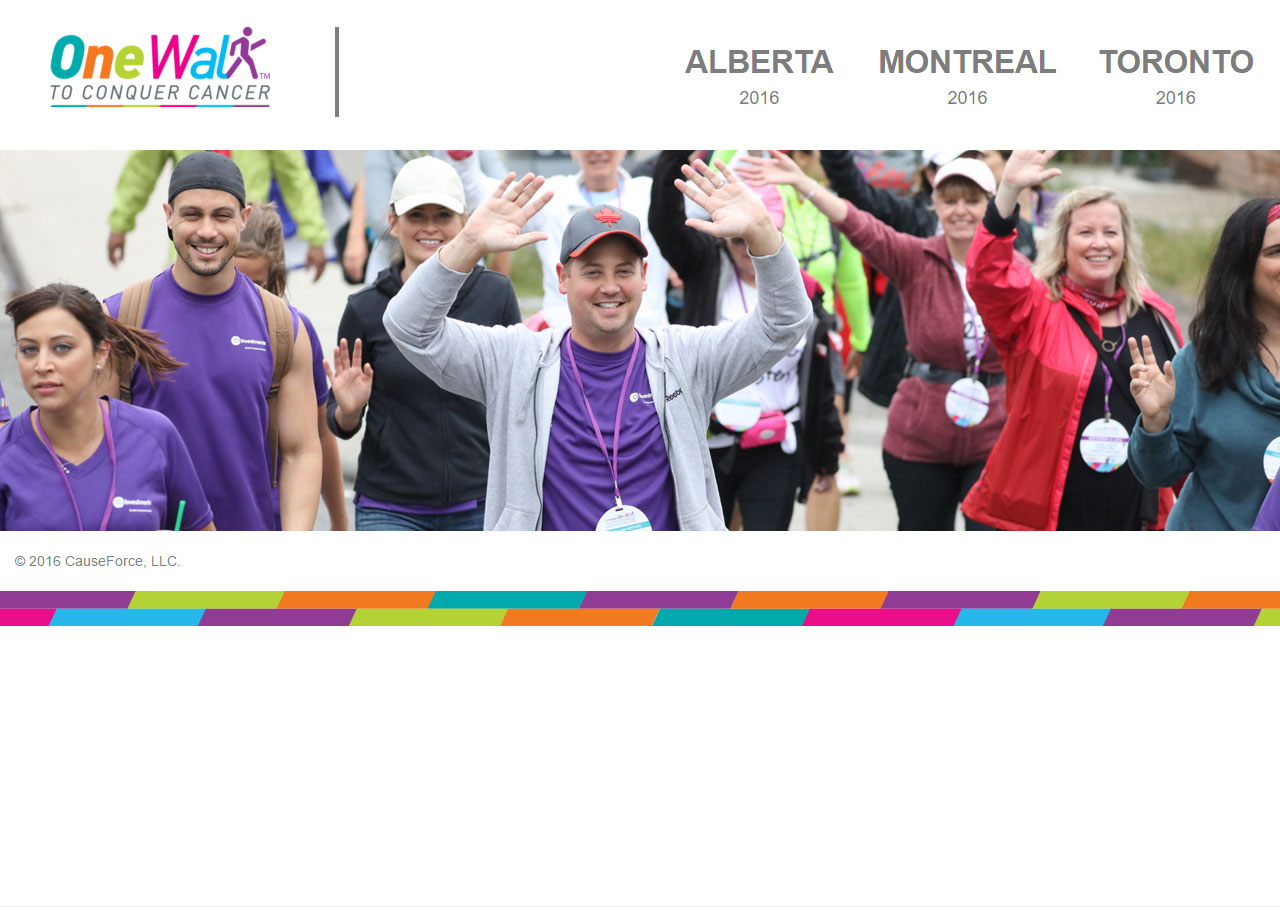
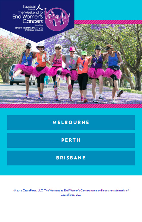
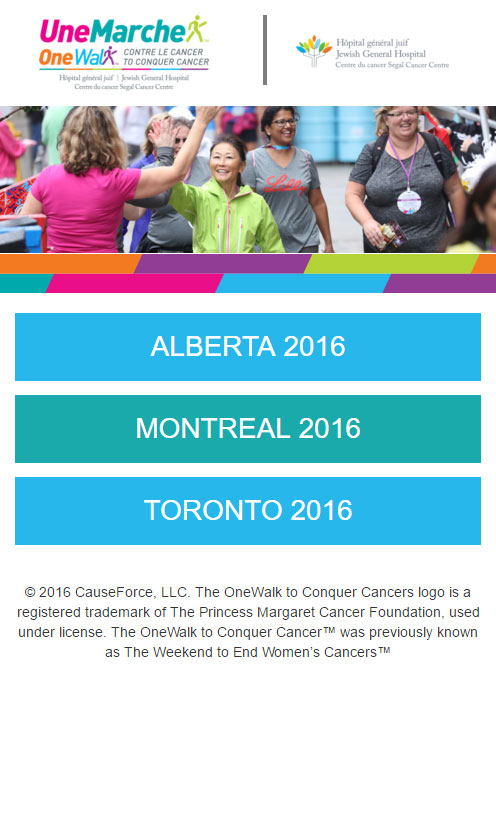
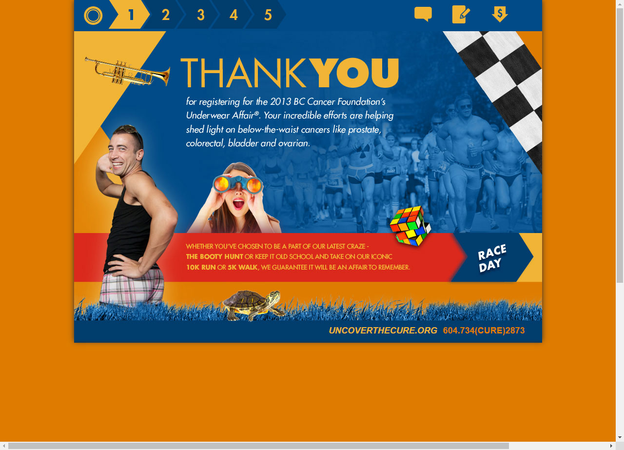
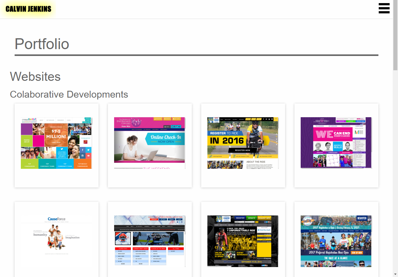
PGV Design Development

PGV Design Development Portfolio

onewalk.ca

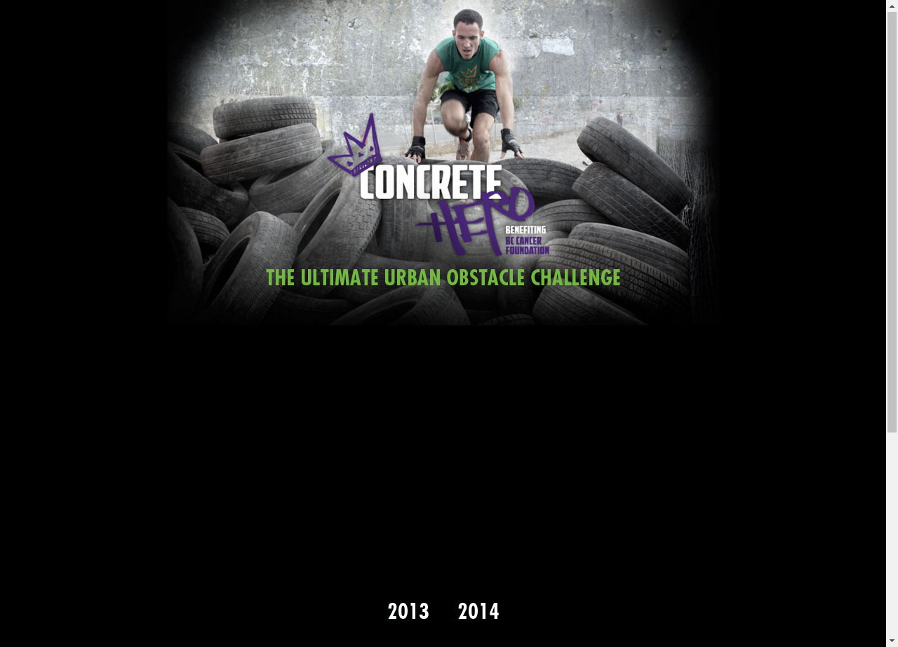
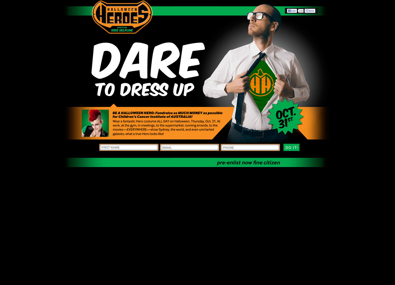
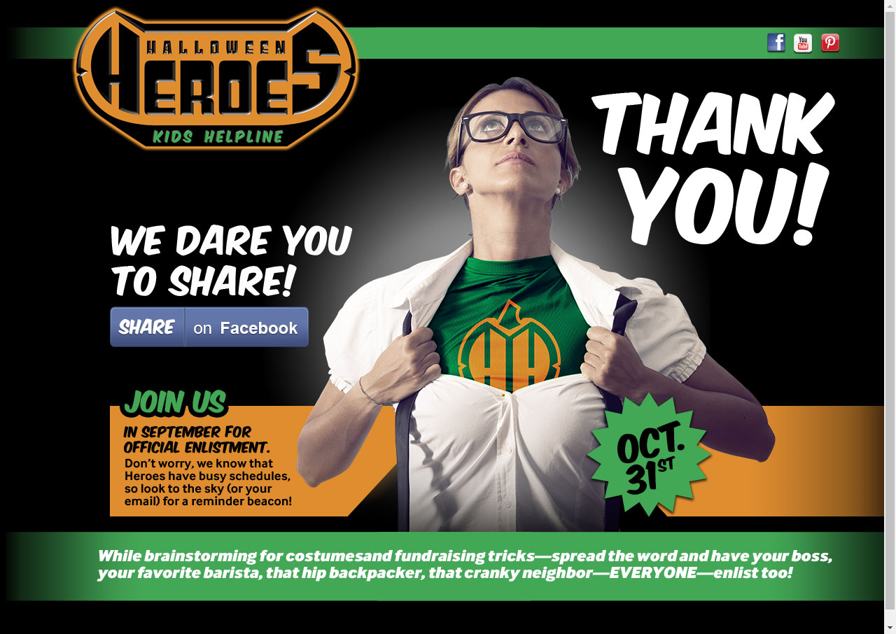
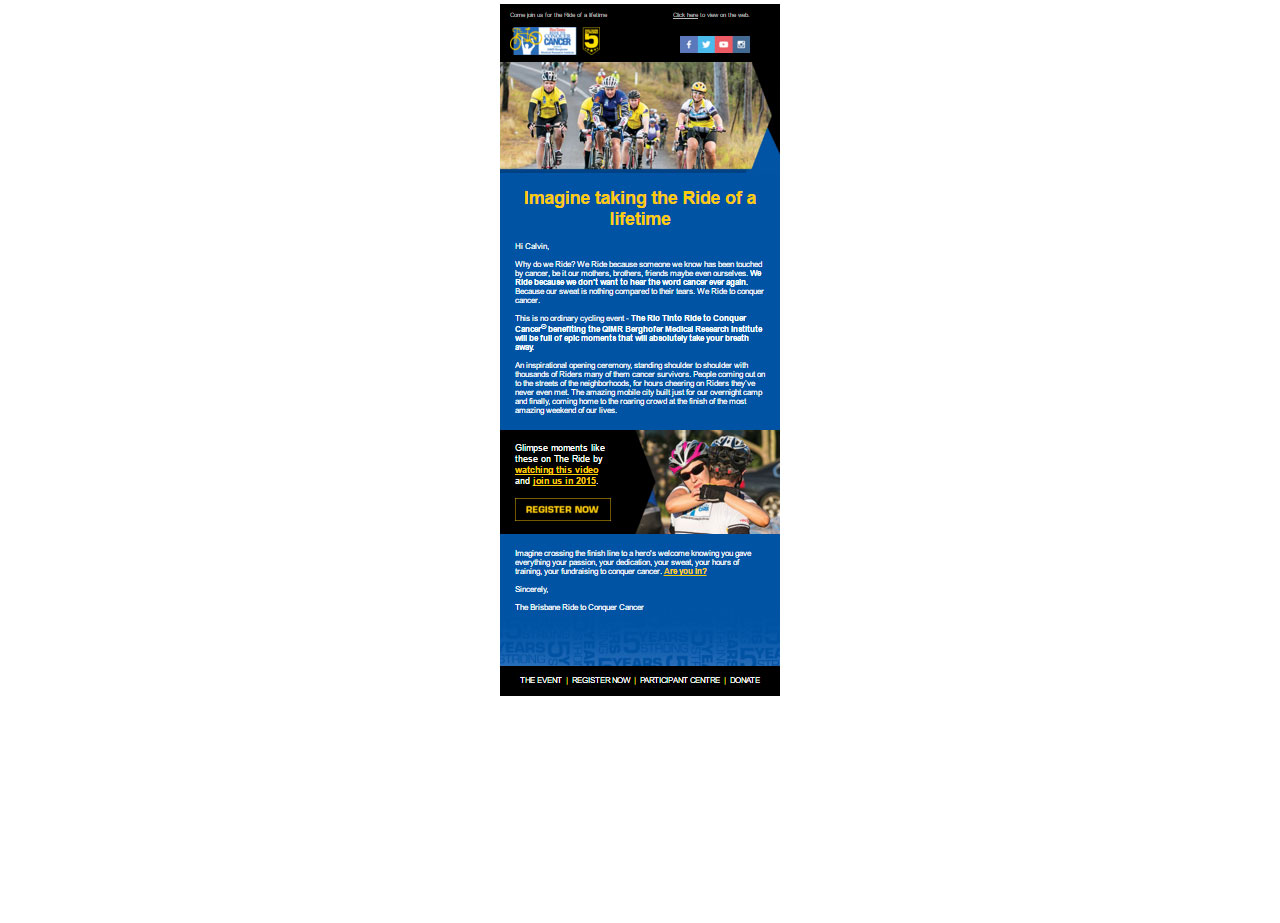
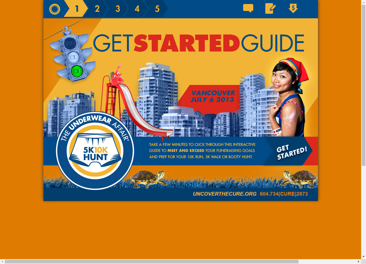
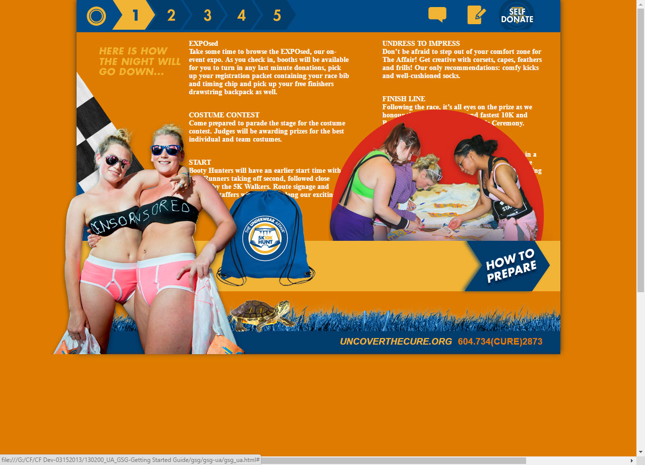
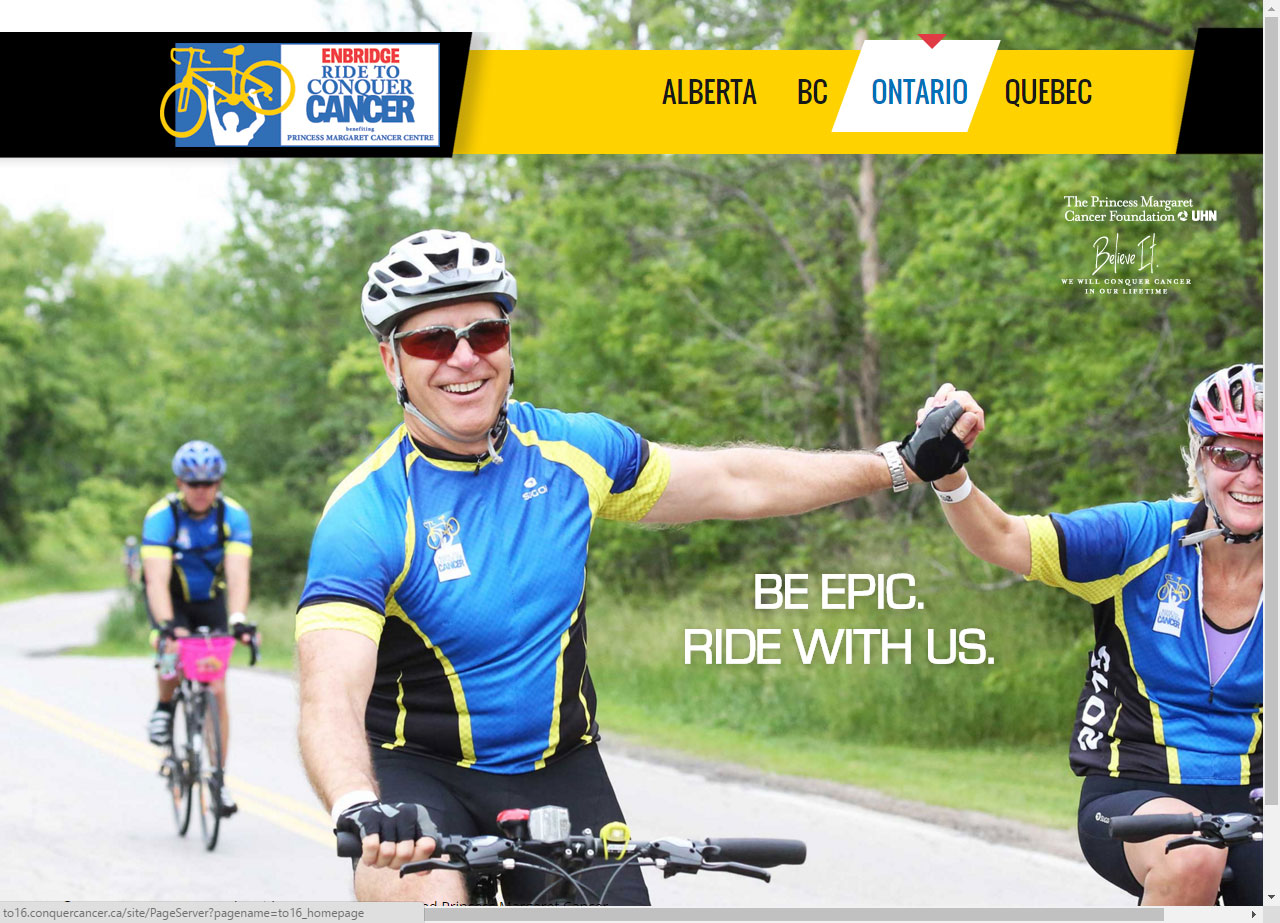
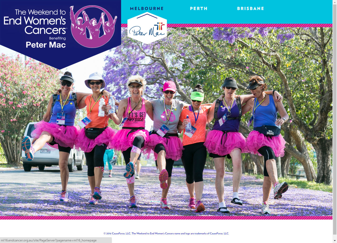
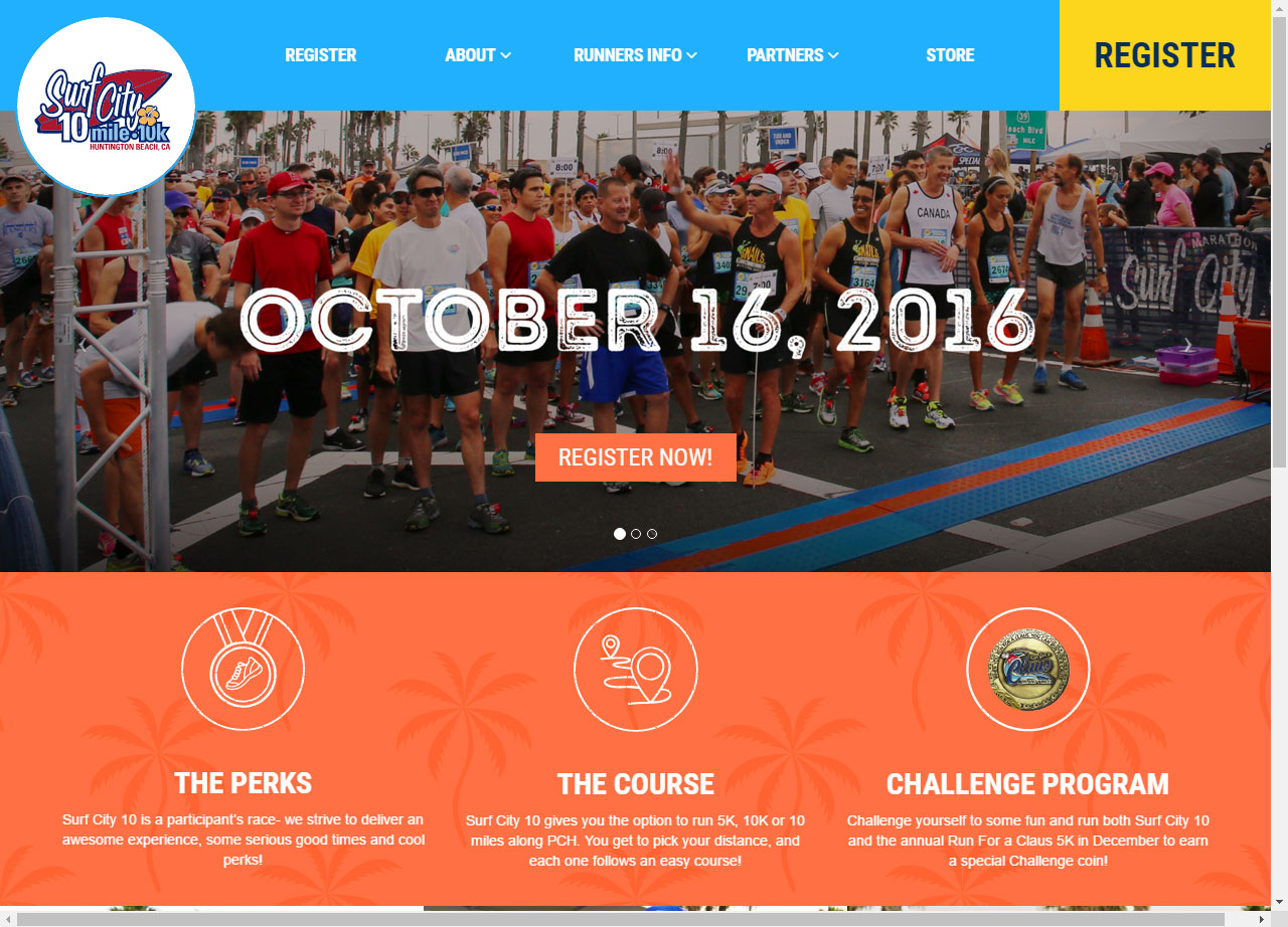
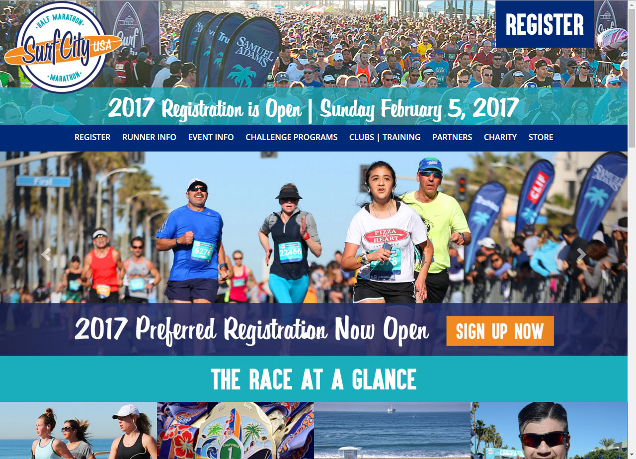
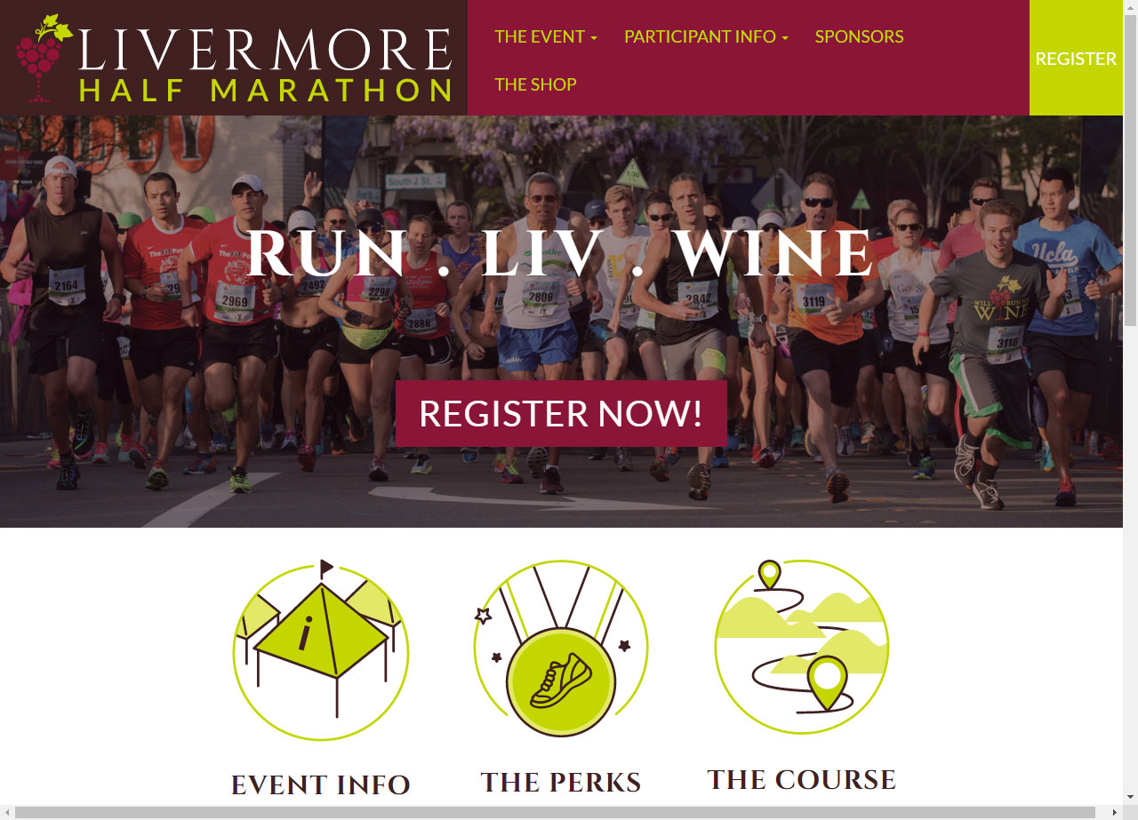
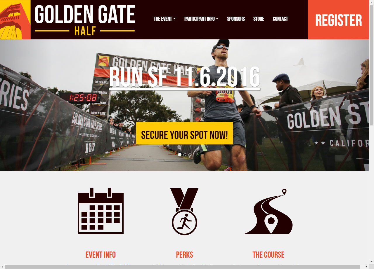
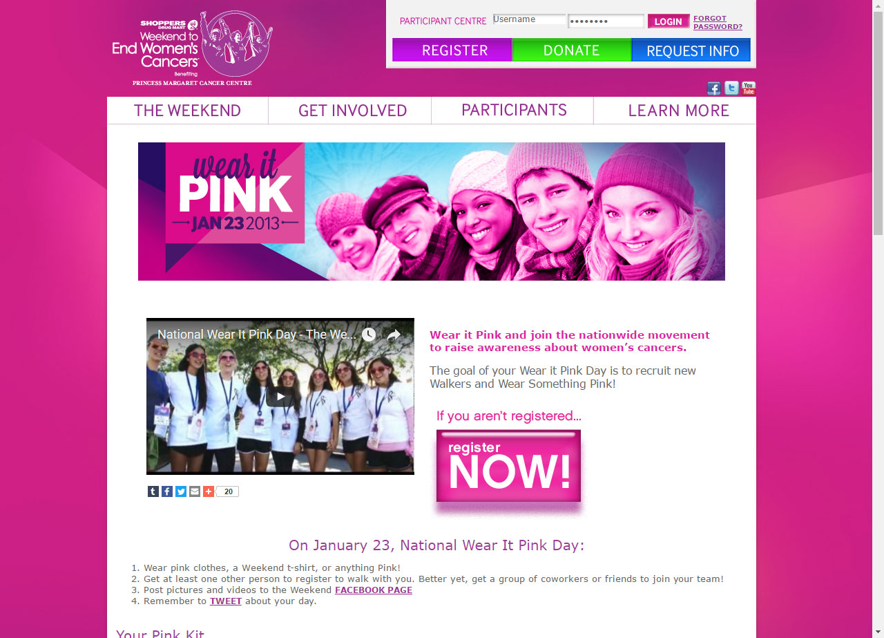
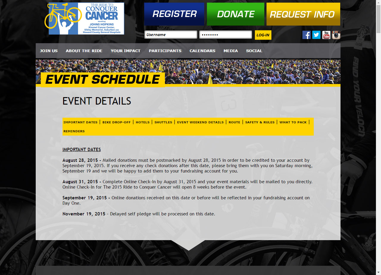
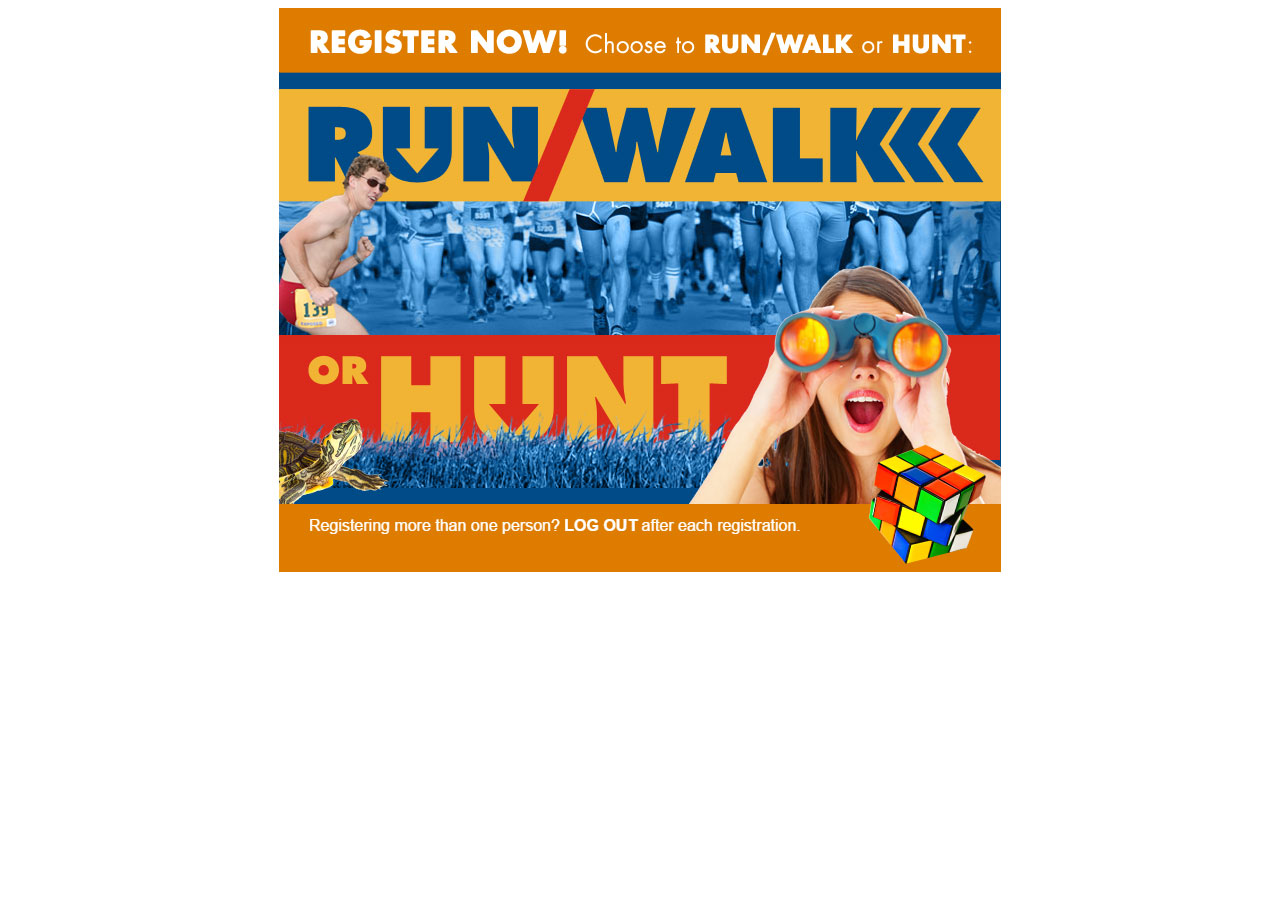
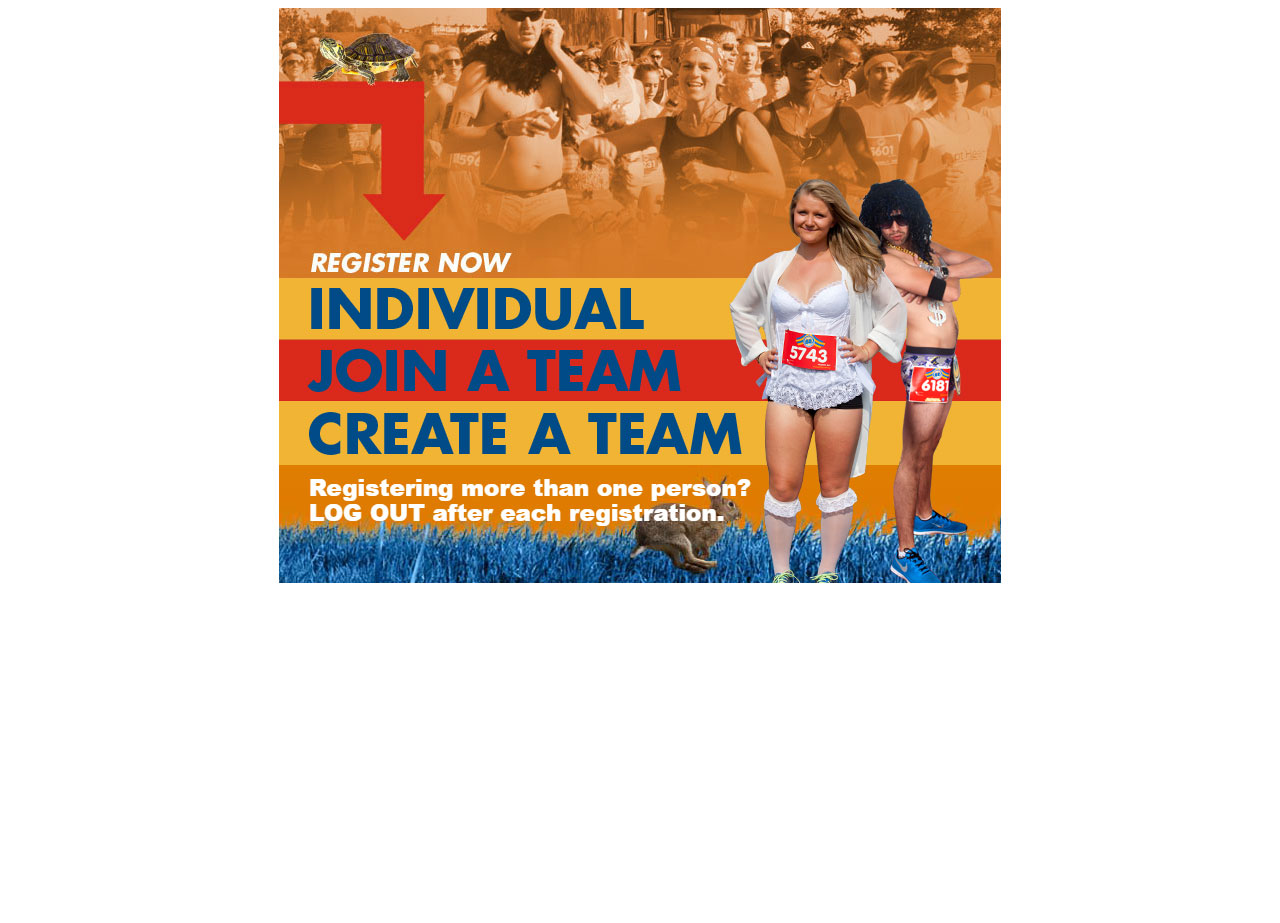
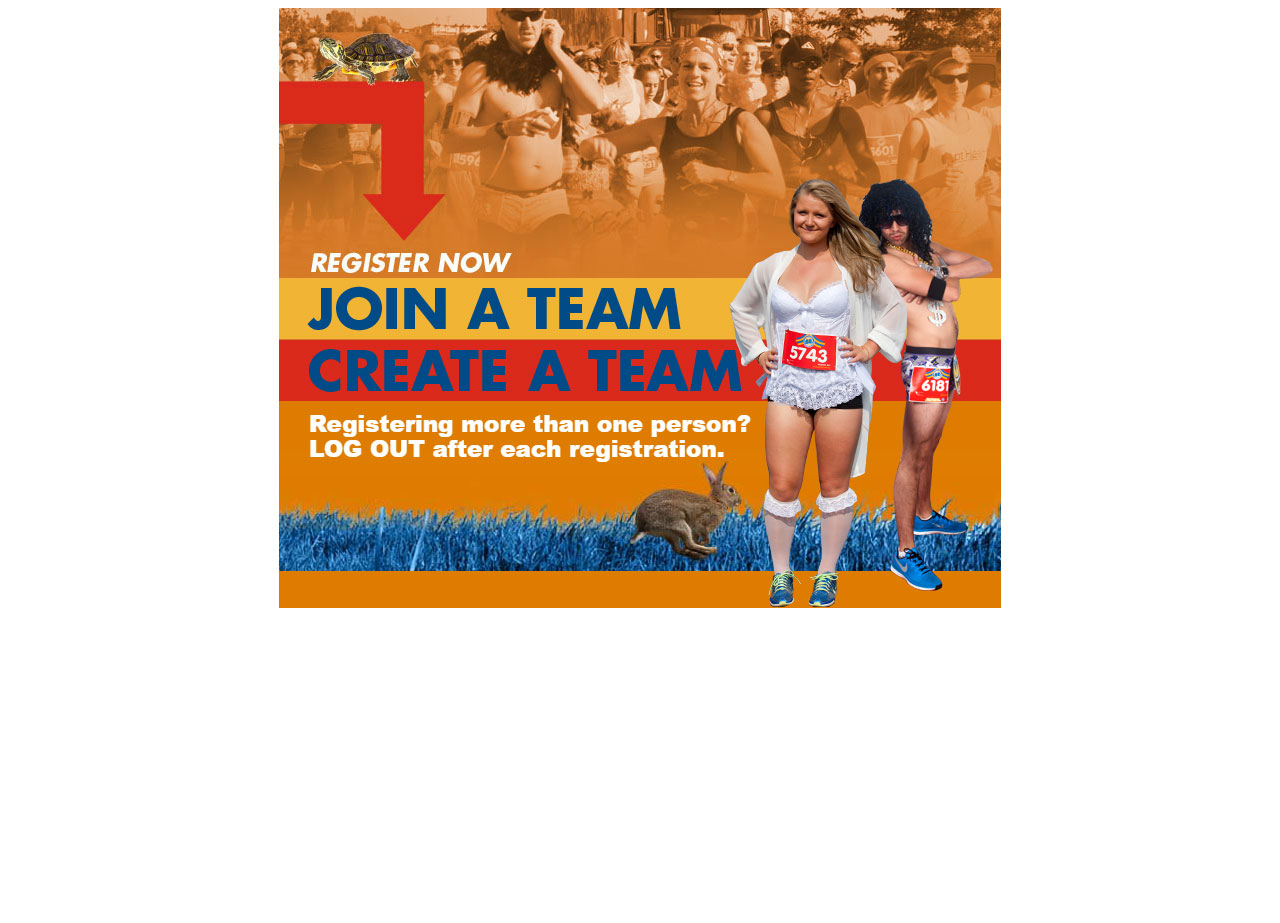
This custom responsive website was built in Convio Luminate. Key technologies utilized are HTML5, CSS3, jQuery, and the framework Foundation by ZURB. I primarily served as lead onsite developer, with the responsibilities of integrating the off-site studio's design and develoments, along with the day to day content creation and updates.

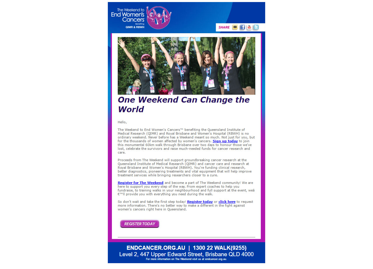
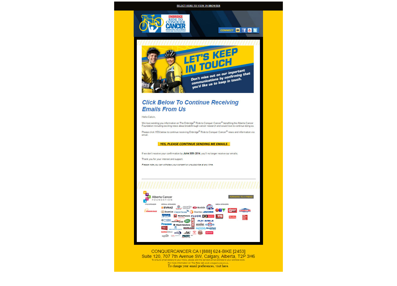
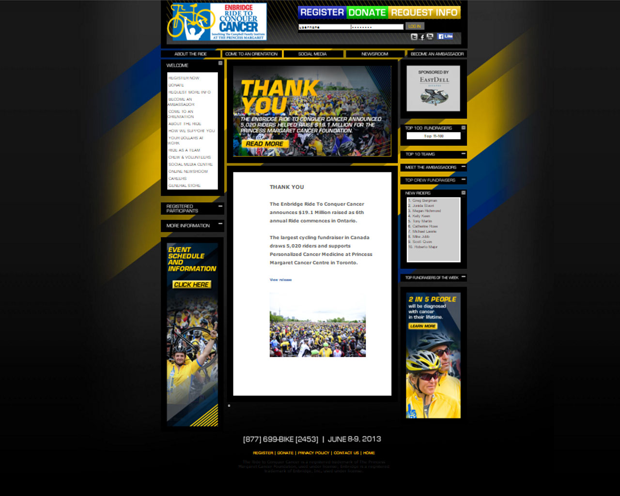
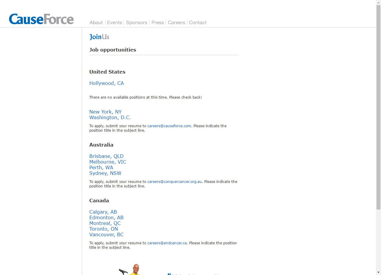
This was the first web design and development project we outsourced. Due to miscommunication, between our marketing manager and the vendor, I completed the integration. The website was originally created in Wordpress; however, our fundrasing platform for front and back end developments was Convio. Due to my experience working with this application platform, I was able to have the agency export the pages from Wordpress, which I then tailored for our system and file structure.

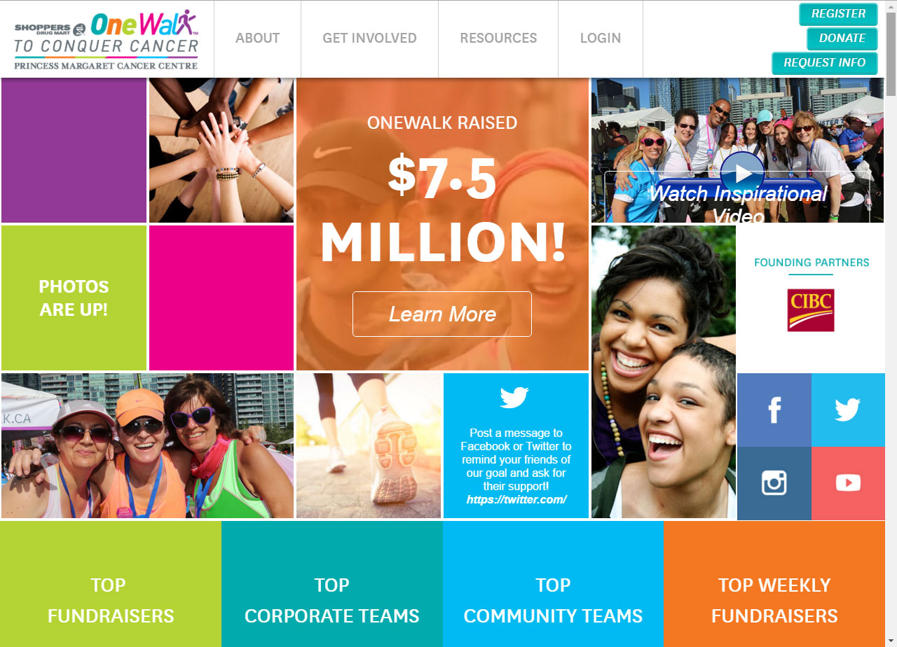
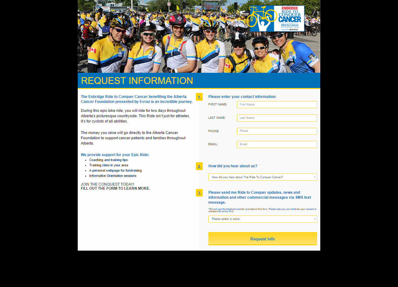
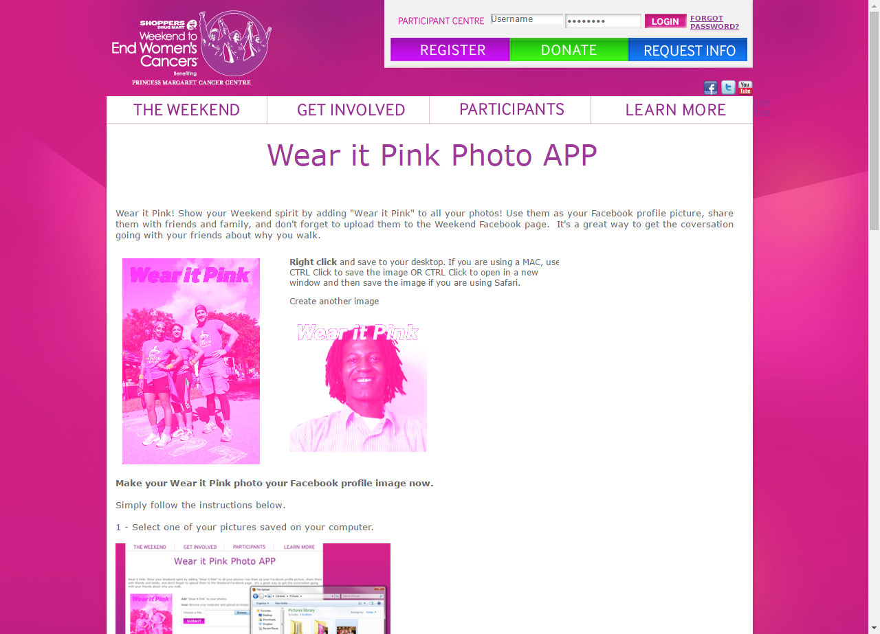
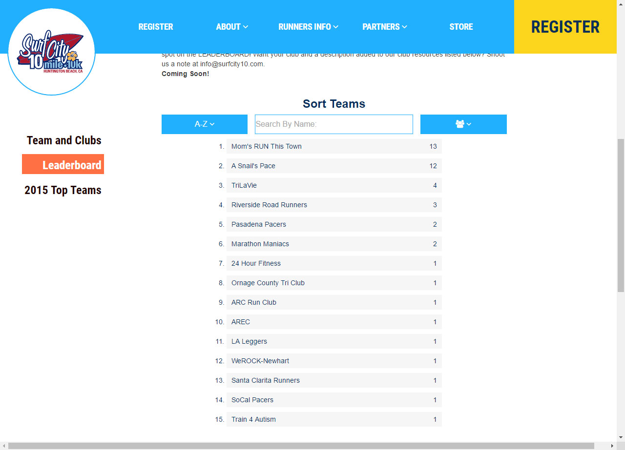
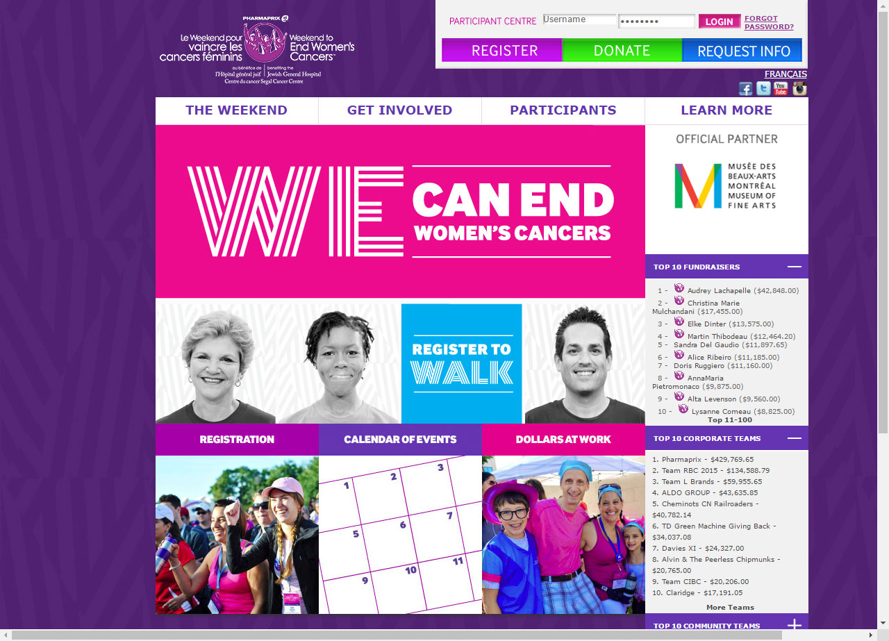
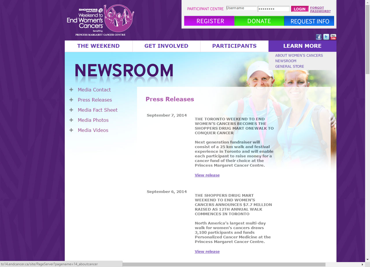
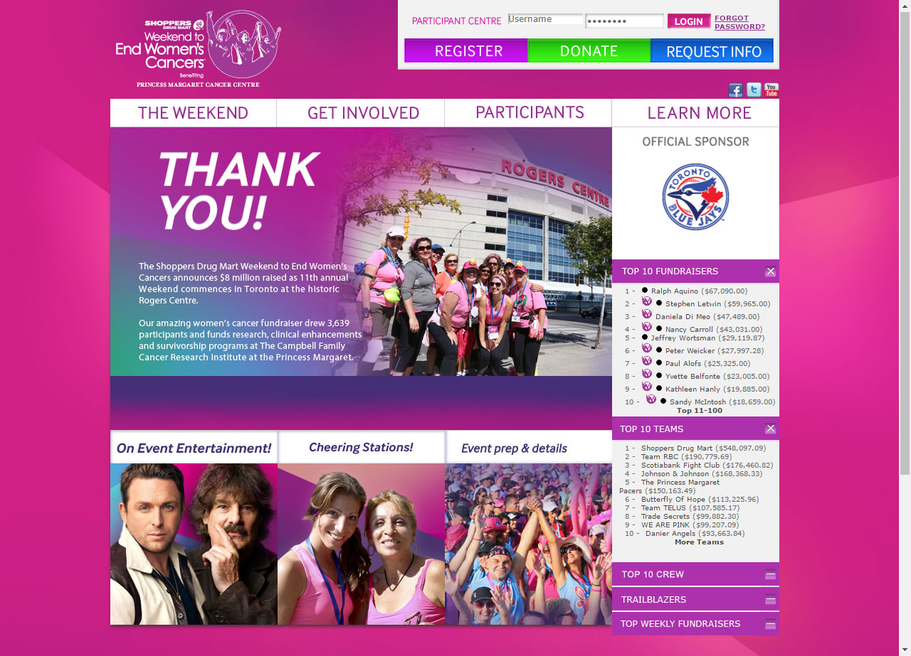
In addition to successfully integrating this design into Convio, I was also responsible for edits and additions to the design along with configuring user forms and the login area. For each site we created, I also had to interface with out Convio dedicated support to generate data for registered participants. The lists were either in html or generated using proprietary Convio tags, which I consumed with JavaScript and displayed in desired formats.

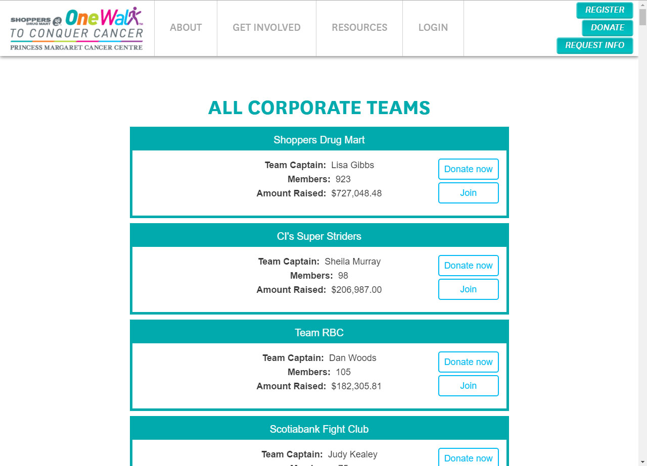
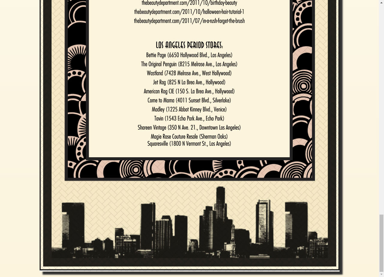
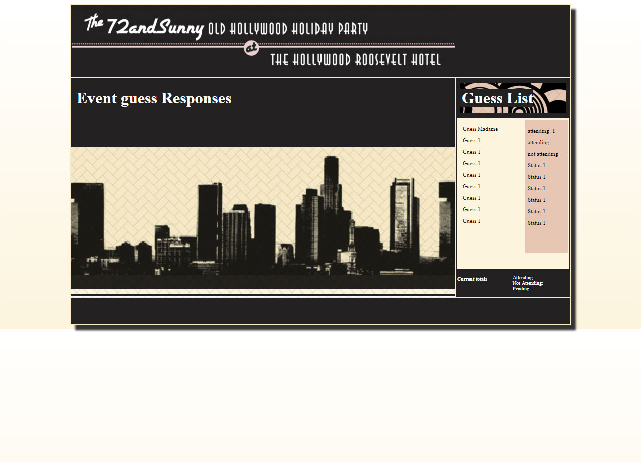
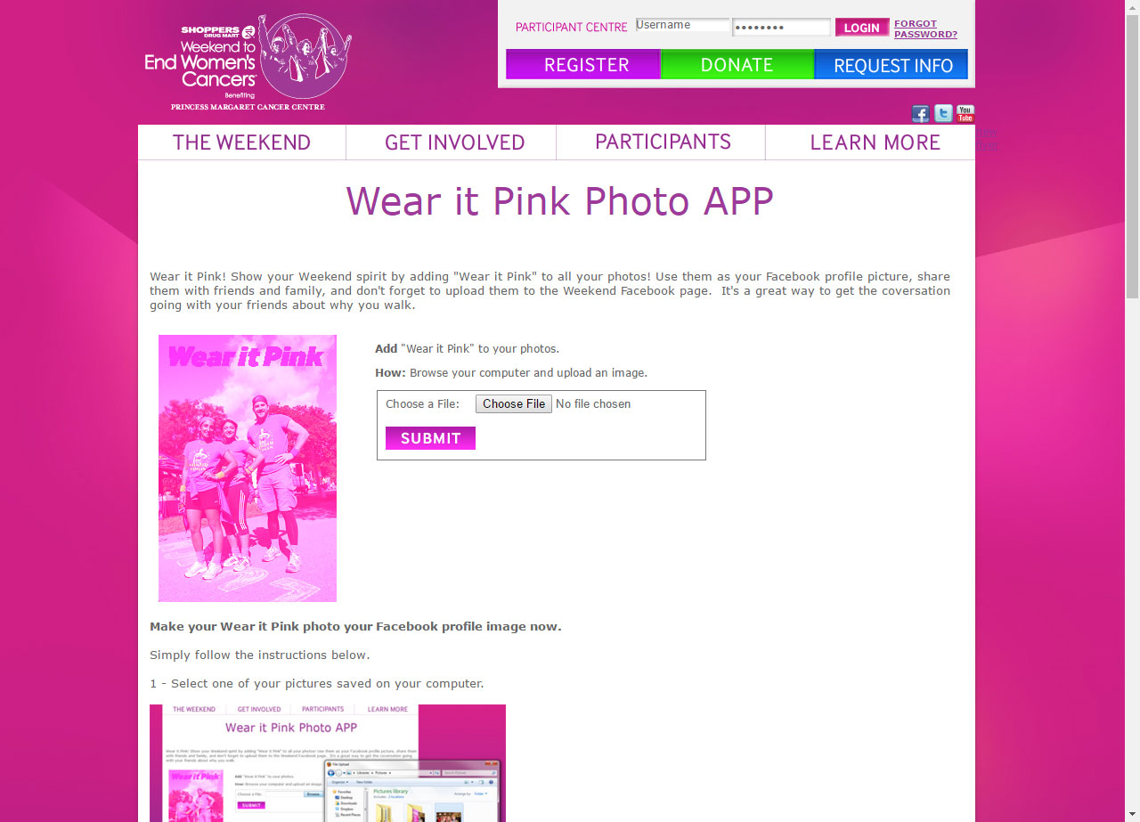
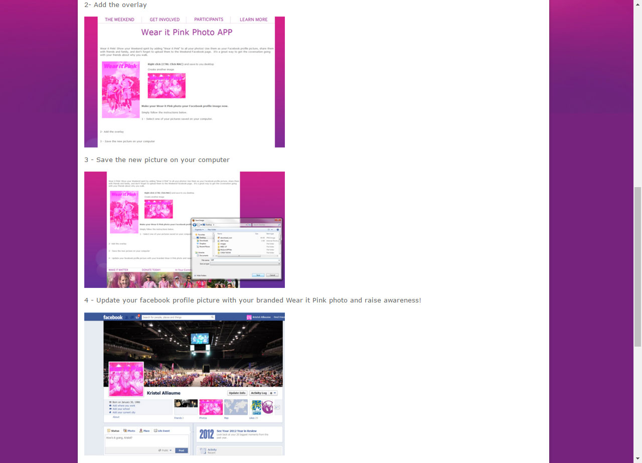
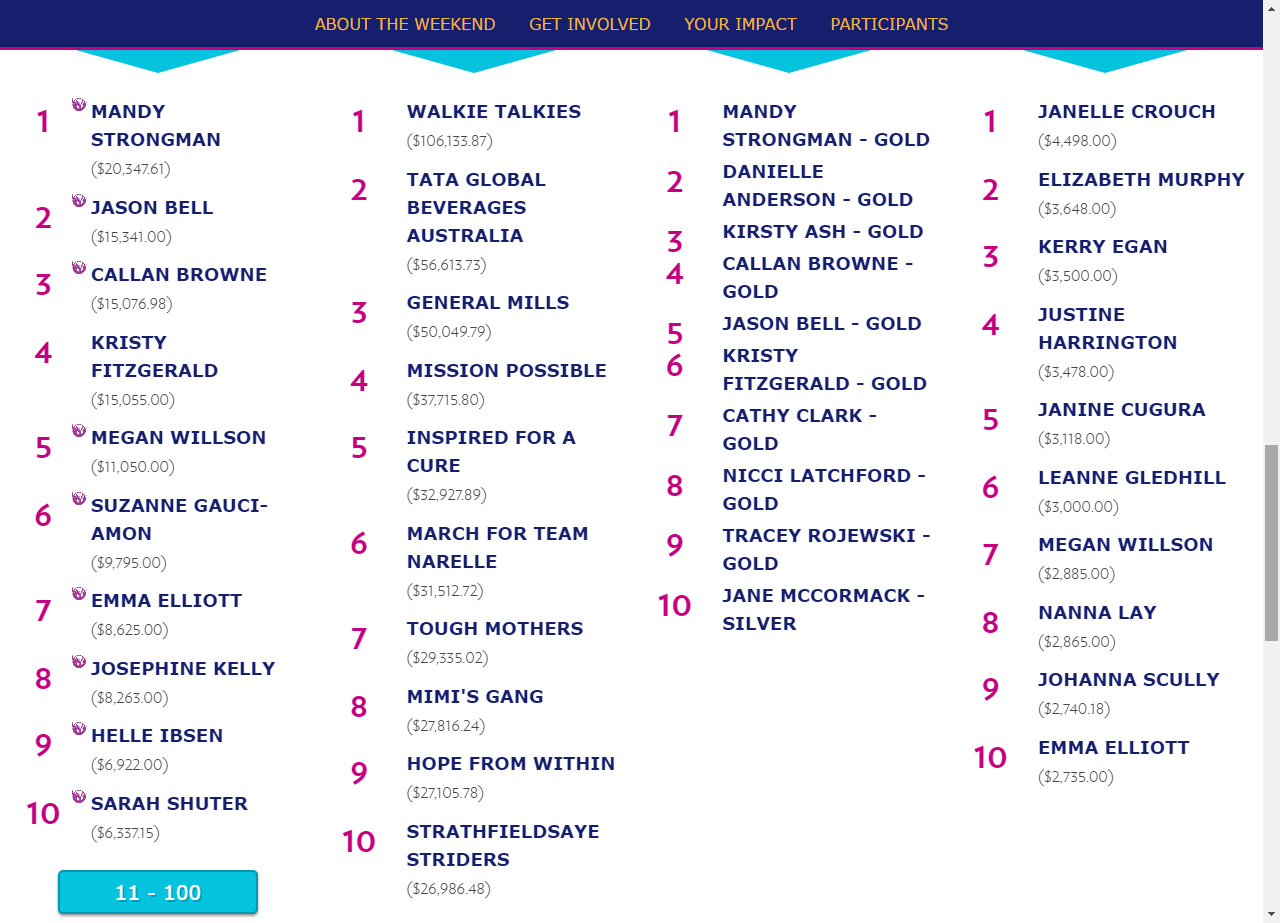
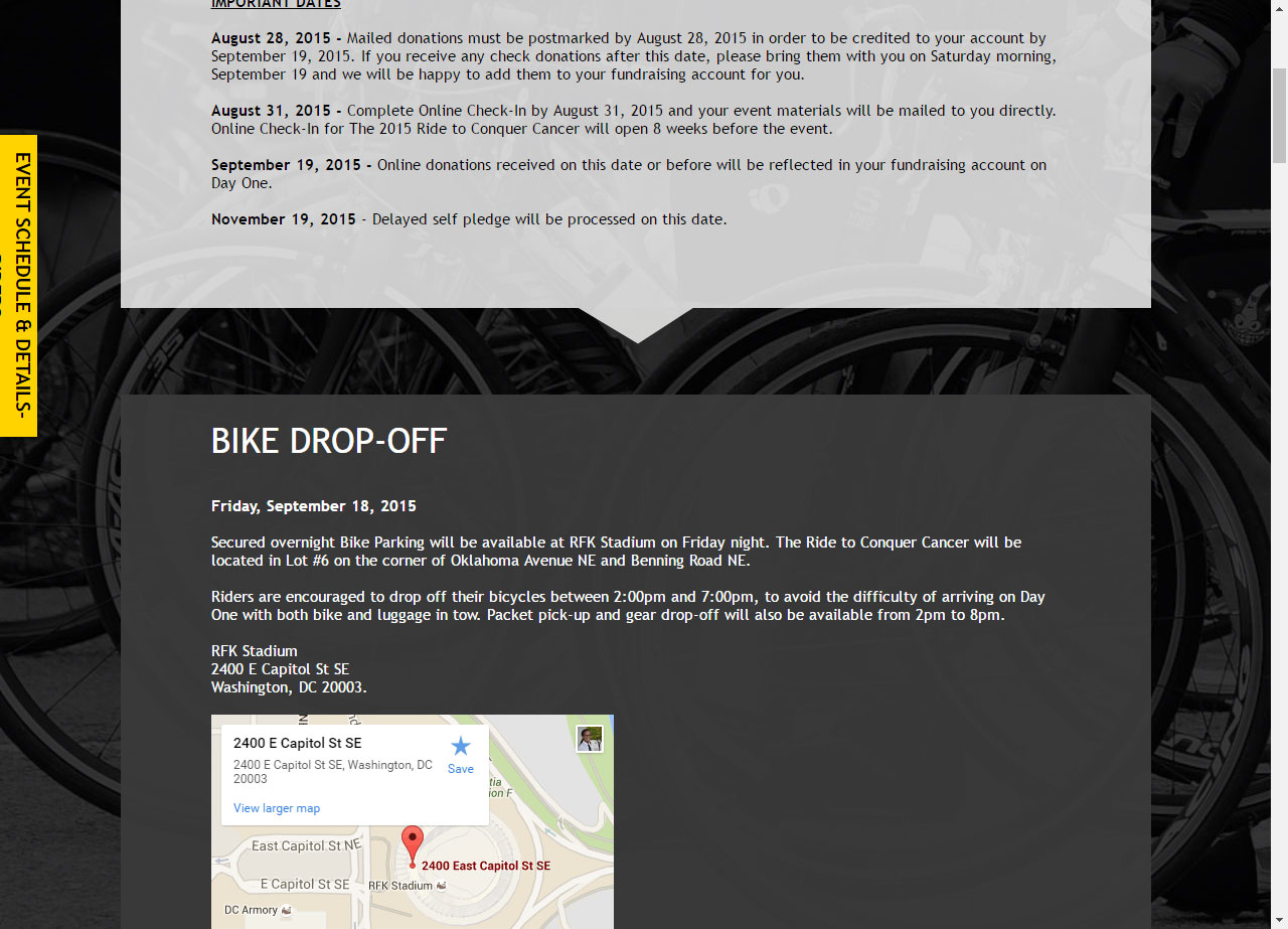
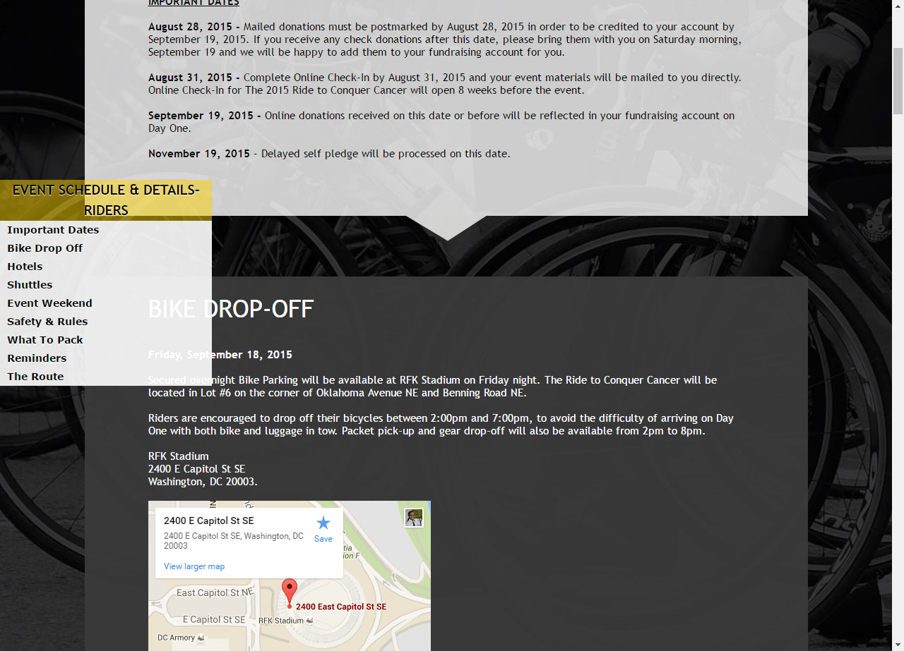
I created this standalone list page with the concept described above and styled it with my fellow Developer's design. Basically, I used jQuery's ajax load function to consume the html file, then for each element of interest, copy it's content into new elements to fit the requirements. It was quite a fun and beneficial, as it made for a great informative content page, which was sought out by participants.

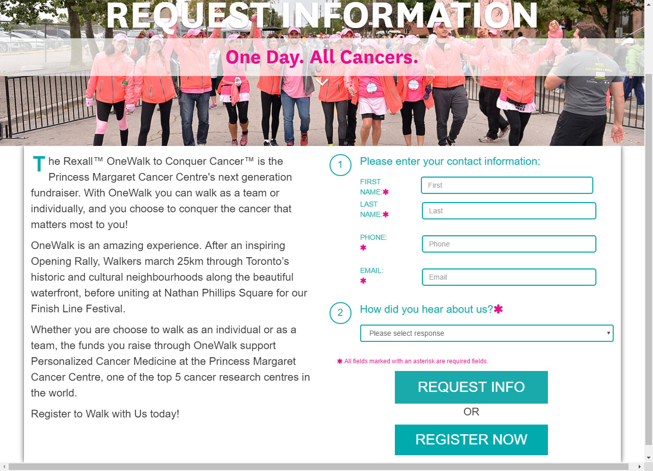
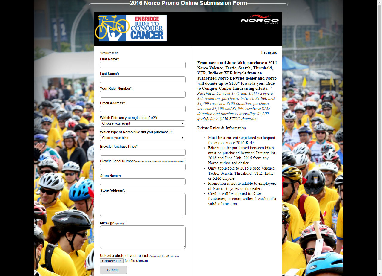
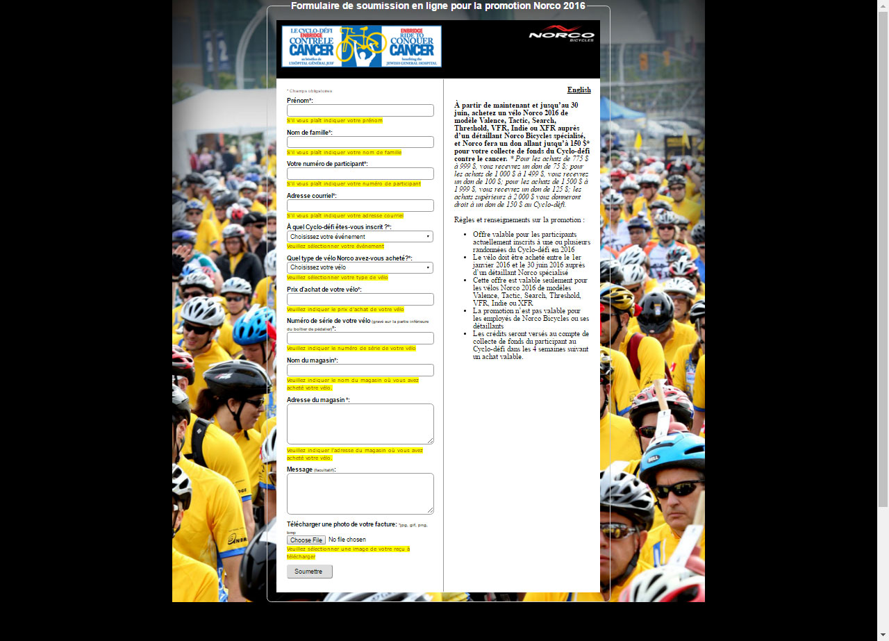
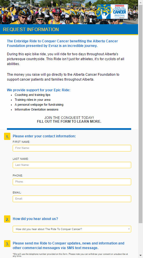
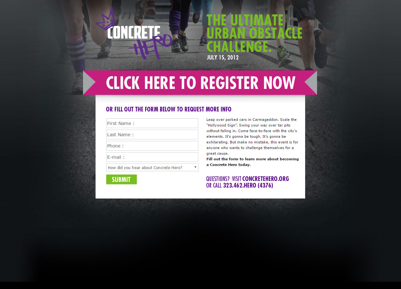
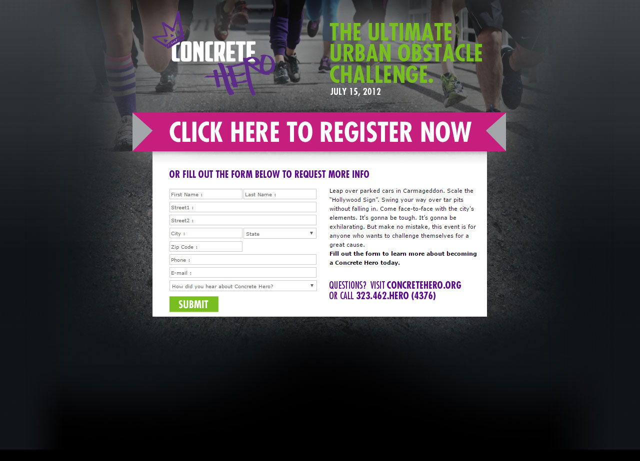
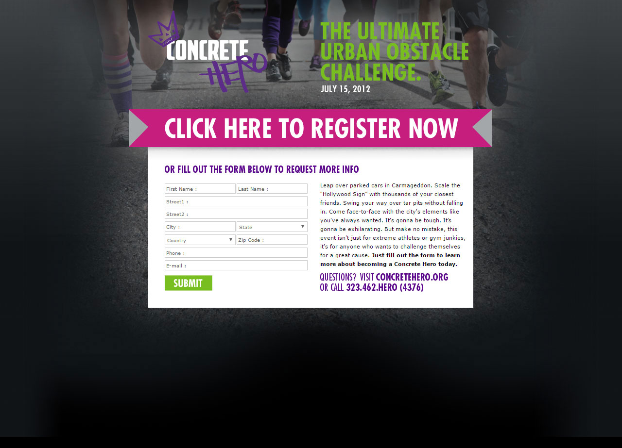
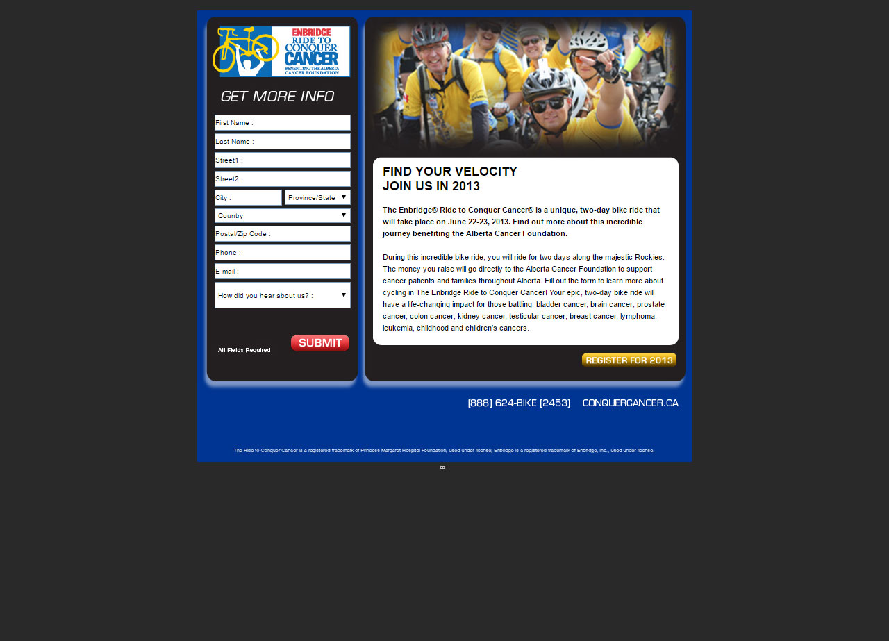
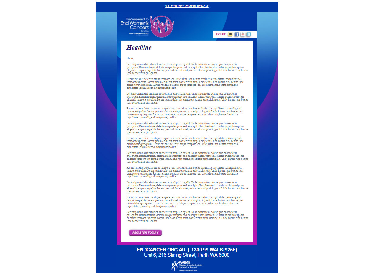
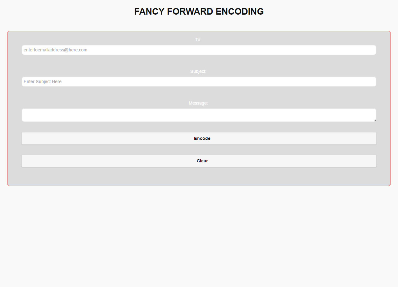
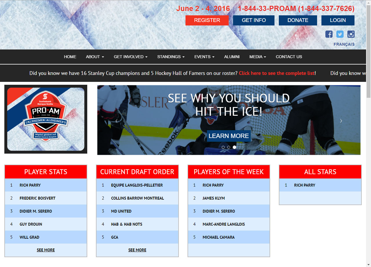
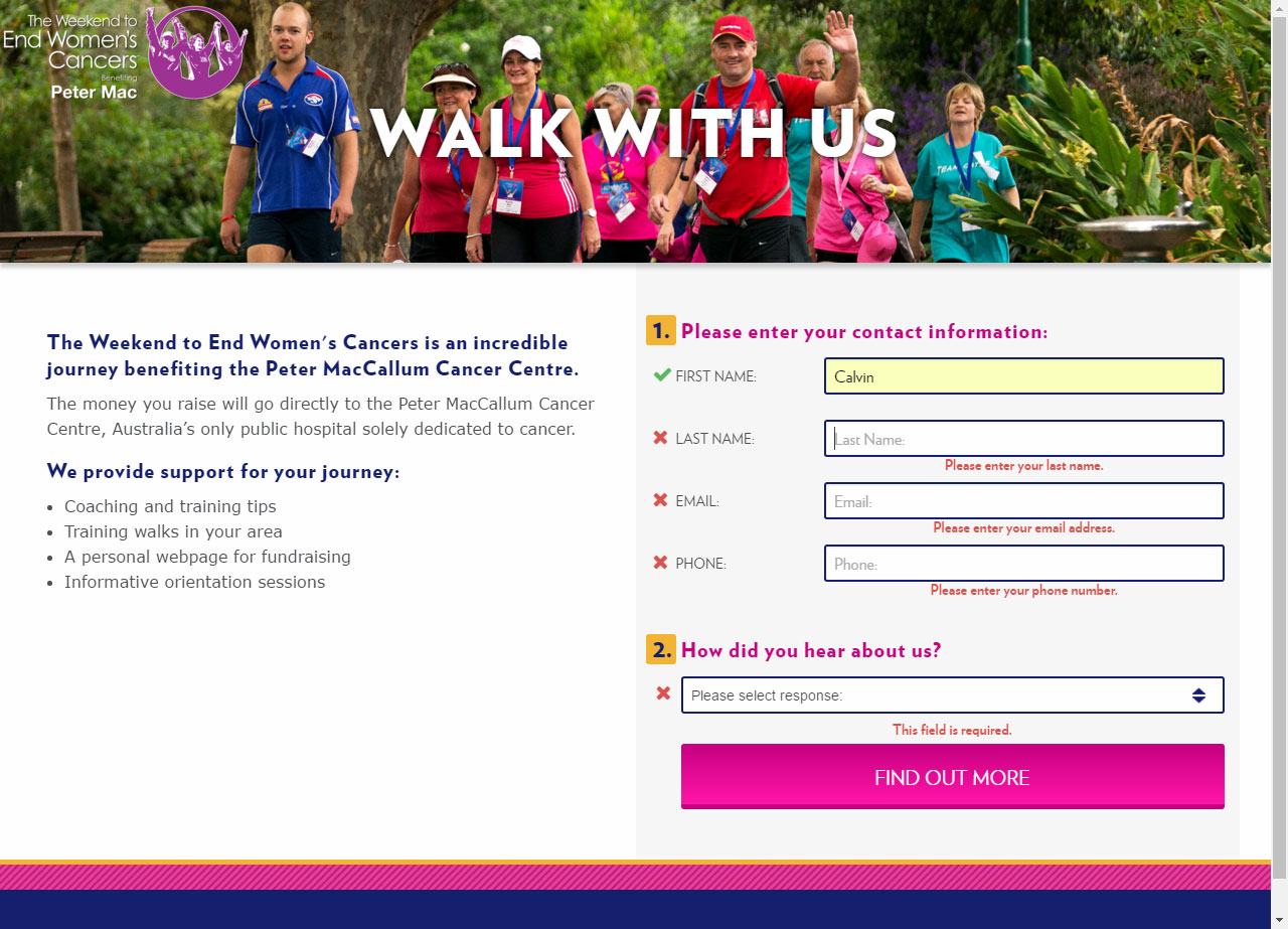
Convio allows for generic forms/surveys to be embebed into a page on the platform. The code structure provided by this system, was none-responsive. I figured out a couple ways to extract out the html from the generated froms and add in required values and id's to build responsive landing pages for both on and off-site use.

This website was designed and mostly developed by an external studio. At the time it's files were handed over to us, a second developer joined our team, whom was tasked with the effort of modifying the design to suit our porduct manager's requests. Once the template was completed, I created the file structure, configured Convio, and versioned out the design for all 4 cities of the ride to conquer cancer event. This event was hosted in Vancouver, Alberta, Montreal, and Toronto.

My work on these later sites ranged from knowledge sharing to onboard new developers, figuring out better ways of using Convio, building the look and feel of the user login areas, pulling informational lists with ajax, setting up survey forms and autoresponders, configuring the participant centers and wrappers, content migration and creation, sponsors addition, along with handling the sites day to day update requests, from our Marketing Coordinators.

This suite of sites are all responsive. There was not an app or Facebook app for each site. Hence, in 2014 it was decided that all new designs going forward must be responsive. Prior to these I had to configure Convio to serve up a mobile version of our sites to mobile devices. The move to the responsive design was far more cost effective and advantagious, than our precious setup. Mobile bounce rates decreased and content interaction increased.

This was the look of our 2014 site. It was our first attempt at responsive design. It was a collaboration between our marketing director, online marketing manager, art director, 2 designers, and myself. Our team wanted to move into the future, with current technologies, and I had to make it happen. As I was not a responsive developer, I had to educate myself by reading the book "Responsive Web Design" in order to grasp the concepts of this design philosophy, along with techniques. With that knowledge, I built out our agreed upon design. It was haled as a success, and paved the way for the template to be used in 4 Canadian, 5 Australian, and 3 USA cities' event sites. It was an improvement over our long stagnant design, which spanned some 3 plus years of continuous use.

When I joined the CauseForce team, this is what the site designs looked like. At that time, I was supported by a web administrator for Convio configurations, and I was mainly responsible for refreshing the look of these properties, working with our Graphic Design team, for each year's releases, and adding pages and content, along with xml files for videos and javascript files for sponsors.

There was a splash page for each country's events. Visitors to our main domain then get a chance to select the city site they are interested in. For 3 years I built and maintained the splash pages.

This website was designed and developed in-house, in order to cut back on the costs of outsourcing our developments and satisfy our new on-site developer's desire to actually create something, instead of only modifying someone elses material. Our design department provided the design, our developer developed the site, and I incorporated it into Convio and versioned it out for other cities hosting our Australian walk event, The Weekend to End Women's Cancers.

These are sporting event sites, serving as a hub of information and a tool for fundraising. We aimed to capture the look and feel that is appealing to our focus group. For this set of sites I configured and developed the paticipant center, which is the login area, for sending soliciting emails and adding content to their provided personal page, whose template is provided by the Convio system. I basically added the look and feel of our client facing site, and add content provided by the site's marketing coordinator. As with all sites developed during my time with CauseForce, I was also responsible for building additional content pages and completing general site update requests.

In setting up the event sites, I also created survey forms and their respective confirmation/thank you pages, for prospective participants to request information. The data collected here is added to the Convio backend to be utilized by our sales/support team. I had to test each form to ensure data capture is correct. Specifically for this site, I started merging my fellow developers form validator code, which he created using FormValidator, some javascrip, css, and FontAwesome. It made for a more interesting form filling experience.

My top10 list code was utilized to build and augment the lists of this site, along with others going forward. It gave a better way of displaying the participant's statistics.

A splash page was created for this event. It contains links to all 4 cities hosting our events.

I was responsible for setting up these websites in Convio, versioning out the code for 3 cities, integrating our developer's code into the system, along with enabling language toggle, building the user login area, request for information forms, and making other content pages. I also added tracking and made minor aesthetic edits, after the build was completed, in order to suit marketings requests.

This site was interesting because when we aquired it, we needed to migrate the historic data. Ultimately, we settled for a data entry specialist to transfer pertinent information, as our Convio database sturctures did not conform to expections. Even with that big obstacle, we made it happen and our benifactors happy with the resulting product.

This was one of 6 events aquired, as our company restructured under a parent company(OmniForce) and separate our none-profit events(CauseForce) from our for profit events(RaceForce). The challenge here lied in the fact that there was no hand-off, from the previous managers, and new technologies, which we never worked with before. It was actually fun. I learned the Volusion system and it's file architecture to become our sole expert in the company. The knowledge I gained helped us to successfully rebrand the site and update it, while still maintaining the interest of our thousands of participants, from the prior years.

I worked with two didicated marketing coordinator and marketing manager for RaceForce to completely refresh the site's design, from what we initially received. I thought them how to use the system, adding pages, products, slides, sponsors, and export a csv of email subscribers and customers/participants. It is worth mentioning that for halloween we created a theme/social media competition, where I placed obvious and obscured pumkin images all throughout the website, for participants to find and enter a drawing. On the home page, I created an overlayed jquery animation of bats flying out of the screen, seemingly towards the user. That was also fun to execute.

The leaderboard I created for runsurfcity.com was duplicated and modified for this site. The RaceForce marketing manager requested this of me and provided a path to an xml file containing the pertinent information. To complete this task, I utilize jQuery along with conventional javascript, then CSS to style my resulting markup. Using jQuery's ajax, I consumed the the nodes of the xml along with thier attributes, then write it back to the page in the desired format. My work was then fused with my fellow developers alphabetizing and sorting functions.

Work with our scrappy design team to bring your concepts to life. We’ll equip you with our battle-tested Progressive Design process and the tools to get your product or website off the ground and in front of your users.

Work with our scrappy design team to bring your concepts to life. We’ll equip you with our battle-tested Progressive Design process and the tools to get your product or website off the ground and in front of your users.

Work with our scrappy design team to bring your concepts to life. We’ll equip you with our battle-tested Progressive Design process and the tools to get your product or website off the ground and in front of your users.

Work with our scrappy design team to bring your concepts to life. We’ll equip you with our battle-tested Progressive Design process and the tools to get your product or website off the ground and in front of your users.

Work with our scrappy design team to bring your concepts to life. We’ll equip you with our battle-tested Progressive Design process and the tools to get your product or website off the ground and in front of your users.

Work with our scrappy design team to bring your concepts to life. We’ll equip you with our battle-tested Progressive Design process and the tools to get your product or website off the ground and in front of your users.

Work with our scrappy design team to bring your concepts to life. We’ll equip you with our battle-tested Progressive Design process and the tools to get your product or website off the ground and in front of your users.

Work with our scrappy design team to bring your concepts to life. We’ll equip you with our battle-tested Progressive Design process and the tools to get your product or website off the ground and in front of your users.

Work with our scrappy design team to bring your concepts to life. We’ll equip you with our battle-tested Progressive Design process and the tools to get your product or website off the ground and in front of your users.

Work with our scrappy design team to bring your concepts to life. We’ll equip you with our battle-tested Progressive Design process and the tools to get your product or website off the ground and in front of your users.

Work with our scrappy design team to bring your concepts to life. We’ll equip you with our battle-tested Progressive Design process and the tools to get your product or website off the ground and in front of your users.

Work with our scrappy design team to bring your concepts to life. We’ll equip you with our battle-tested Progressive Design process and the tools to get your product or website off the ground and in front of your users.

Work with our scrappy design team to bring your concepts to life. We’ll equip you with our battle-tested Progressive Design process and the tools to get your product or website off the ground and in front of your users.

Work with our scrappy design team to bring your concepts to life. We’ll equip you with our battle-tested Progressive Design process and the tools to get your product or website off the ground and in front of your users.

Work with our scrappy design team to bring your concepts to life. We’ll equip you with our battle-tested Progressive Design process and the tools to get your product or website off the ground and in front of your users.

Work with our scrappy design team to bring your concepts to life. We’ll equip you with our battle-tested Progressive Design process and the tools to get your product or website off the ground and in front of your users.

Work with our scrappy design team to bring your concepts to life. We’ll equip you with our battle-tested Progressive Design process and the tools to get your product or website off the ground and in front of your users.

Work with our scrappy design team to bring your concepts to life. We’ll equip you with our battle-tested Progressive Design process and the tools to get your product or website off the ground and in front of your users.

Work with our scrappy design team to bring your concepts to life. We’ll equip you with our battle-tested Progressive Design process and the tools to get your product or website off the ground and in front of your users.

Work with our scrappy design team to bring your concepts to life. We’ll equip you with our battle-tested Progressive Design process and the tools to get your product or website off the ground and in front of your users.

Work with our scrappy design team to bring your concepts to life. We’ll equip you with our battle-tested Progressive Design process and the tools to get your product or website off the ground and in front of your users.

Work with our scrappy design team to bring your concepts to life. We’ll equip you with our battle-tested Progressive Design process and the tools to get your product or website off the ground and in front of your users.

Work with our scrappy design team to bring your concepts to life. We’ll equip you with our battle-tested Progressive Design process and the tools to get your product or website off the ground and in front of your users.

Work with our scrappy design team to bring your concepts to life. We’ll equip you with our battle-tested Progressive Design process and the tools to get your product or website off the ground and in front of your users.

Work with our scrappy design team to bring your concepts to life. We’ll equip you with our battle-tested Progressive Design process and the tools to get your product or website off the ground and in front of your users.

Work with our scrappy design team to bring your concepts to life. We’ll equip you with our battle-tested Progressive Design process and the tools to get your product or website off the ground and in front of your users.

Work with our scrappy design team to bring your concepts to life. We’ll equip you with our battle-tested Progressive Design process and the tools to get your product or website off the ground and in front of your users.

Work with our scrappy design team to bring your concepts to life. We’ll equip you with our battle-tested Progressive Design process and the tools to get your product or website off the ground and in front of your users.

Work with our scrappy design team to bring your concepts to life. We’ll equip you with our battle-tested Progressive Design process and the tools to get your product or website off the ground and in front of your users.

Work with our scrappy design team to bring your concepts to life. We’ll equip you with our battle-tested Progressive Design process and the tools to get your product or website off the ground and in front of your users.

Work with our scrappy design team to bring your concepts to life. We’ll equip you with our battle-tested Progressive Design process and the tools to get your product or website off the ground and in front of your users.

Work with our scrappy design team to bring your concepts to life. We’ll equip you with our battle-tested Progressive Design process and the tools to get your product or website off the ground and in front of your users.

The goal for this site was to have a clean design, which is organized and easily navigable, while showcasing my work using some of the animation techniques I like. It is content rich, but not overwhelming, due to the layout used in presenting information in a compact fashion.

As this was my first time building a portfolio, it proved to be an extraordinary feet in content curation. Numerous images had to be tracked down or created from screenshots in order to describe my work. The copy descriptions are a monumental feet of it's own. Since I chosed a large sample of my projects, I had to create mountains of copy to detail my involvement in each. It was daunting, but quite an accomplishment, for someone who usually obtain copy/content from marketing. It was fun, as it provided a great opportunity to review and practice producing massive content.

The content pages are nicely organized, with the help of the awesome grid system of Foundation. It makes rapid development of responsive items easily achievable. It's logic determines behavior, with the application of correct classes and data attributes. There was no need for me to manually create individual flexible items, just apply responsive design concepts, using this framework.

With the advent of the extremely interesting 2016 elections campaign, this web property is meant to launch and showcase it's owner's creative talents in puppet creation and video theater. I was contracted to build and develop a captivating web presence for the materials produced. It marks my first professional project, where I also served as designer, obtaining approval on design before actually building. My experience working with different design departments made the art portion of the process quite smooth.

Working with the client to make this website was quite engaging. Times when we met to discusss the site, we brainstormed concepts, themes, and objectives. With those foundations, I drew from general knowledge to design a concept that satisfy the targeted demographic, then developed the site using current technologies, that are widely available to clients and developers alike. This is benificial from a cost savings prespective, for both, as it utilizies open source technologies, such as Wordpress, jquery, HTML5, and youtube, which will allow for easy support, by any knowledgeable developer. Using FoundationPress allowed me to turn our designed concept into a custom theme, which opens the possibility for original creatiions. Wordpress is benificial to the client, as it provides ease of update, content creatation, and communications.

The Rundown page is a calendar like layout, where I utilized FontAwesome and CSS3 hover animations to give a week by week snap shot of how the presidential race was looking. Simple, but it have the potential to deliver large amounts of information in a compact ui layout

A sample layout using accordion menus to showcase videos hosted on Youtube, or Vimeo, any other player.

The site is responsive, along with other custom features, such as the top banner's introductory animation.

The PrestShop platform is fully customizable. The default theme can be utilized out of the box, but can easily suit one's brand with minor alterations. Learning how to use it, I gathered specification information for digital assets, such as image dimennsions, then later produced requirements. This allowed me to make the necessary graphics in Photoshop and personalized the site with my own content, imeages and copy.

The homepage layout is clean and geared directly to sales. It can be further customized for whatever look and feel suit the project.

I had to create categories and groupings to describe the products in the store. Along with text copy, graphics had to be created as a part of the product information. Basically, the platform can be tailored to fit sales of any business model.

Full and breif desctiptions allow site users to see things at a glance or in full details. It is worth mentioning how I embeded my SoundCloud music files onto the product page of each song I posted for sale. It allowed me to reuse a service I am already utilizing to support this sites development, and the additional interactions from this site adds to the statistics on SoundCloud.

Checkout is maded easy, with guess accounts and Paypal for payment. A user account is created for each purchaser, for them to have access to the degital content they bought. Items can be downloaded from their accounts area and from an automated email sent to the buyer's email address after completing the transaction.

The look and feel of this site is dark and sleek, symbolizing the night life, which the music represents. I took advantage of the Orbit slider, to present the home page images, which is built into the Foundation framework. Having it available, helps with the need to get another plugin from a third party, and it loads along with the site's core scripts, helping with execution time.

I used modern visuals, such as icons from Fontawesome, for navigation indicators, along with a simplified and clean layout.

Along with the streamlined layout, I used smoothscrool navigation techniques to jump to sections on certain pages. This cuppled with scrool to top functionality, users are able to painlessly jump around long pages, with less manual scrolling.

The site is fully responsive. All websites being built today should be responsive. The mobile market is far too large to be ignored. If anything, it should be given more attention than the desktop, being that the trend is towards more mobile use.

Taking advangage of sleek new site design techniques, such as off-canvas mobile navigation menu and content animation, for more interactive engagements. I enjoy animating elements, and I try to apply it wherever I can justifiable do so.

Work with our scrappy design team to bring your concepts to life. We’ll equip you with our battle-tested Progressive Design process and the tools to get your product or website off the ground and in front of your users.

Work with our scrappy design team to bring your concepts to life. We’ll equip you with our battle-tested Progressive Design process and the tools to get your product or website off the ground and in front of your users.

Work with our scrappy design team to bring your concepts to life. We’ll equip you with our battle-tested Progressive Design process and the tools to get your product or website off the ground and in front of your users.

Work with our scrappy design team to bring your concepts to life. We’ll equip you with our battle-tested Progressive Design process and the tools to get your product or website off the ground and in front of your users.

Work with our scrappy design team to bring your concepts to life. We’ll equip you with our battle-tested Progressive Design process and the tools to get your product or website off the ground and in front of your users.

Work with our scrappy design team to bring your concepts to life. We’ll equip you with our battle-tested Progressive Design process and the tools to get your product or website off the ground and in front of your users.

Work with our scrappy design team to bring your concepts to life. We’ll equip you with our battle-tested Progressive Design process and the tools to get your product or website off the ground and in front of your users.

Work with our scrappy design team to bring your concepts to life. We’ll equip you with our battle-tested Progressive Design process and the tools to get your product or website off the ground and in front of your users.

Work with our scrappy design team to bring your concepts to life. We’ll equip you with our battle-tested Progressive Design process and the tools to get your product or website off the ground and in front of your users.

Work with our scrappy design team to bring your concepts to life. We’ll equip you with our battle-tested Progressive Design process and the tools to get your product or website off the ground and in front of your users.

Work with our scrappy design team to bring your concepts to life. We’ll equip you with our battle-tested Progressive Design process and the tools to get your product or website off the ground and in front of your users.

Work with our scrappy design team to bring your concepts to life. We’ll equip you with our battle-tested Progressive Design process and the tools to get your product or website off the ground and in front of your users.

Work with our scrappy design team to bring your concepts to life. We’ll equip you with our battle-tested Progressive Design process and the tools to get your product or website off the ground and in front of your users.

Work with our scrappy design team to bring your concepts to life. We’ll equip you with our battle-tested Progressive Design process and the tools to get your product or website off the ground and in front of your users.

Work with our scrappy design team to bring your concepts to life. We’ll equip you with our battle-tested Progressive Design process and the tools to get your product or website off the ground and in front of your users.

Work with our scrappy design team to bring your concepts to life. We’ll equip you with our battle-tested Progressive Design process and the tools to get your product or website off the ground and in front of your users.

Work with our scrappy design team to bring your concepts to life. We’ll equip you with our battle-tested Progressive Design process and the tools to get your product or website off the ground and in front of your users.

Work with our scrappy design team to bring your concepts to life. We’ll equip you with our battle-tested Progressive Design process and the tools to get your product or website off the ground and in front of your users.

Work with our scrappy design team to bring your concepts to life. We’ll equip you with our battle-tested Progressive Design process and the tools to get your product or website off the ground and in front of your users.

The concept of a splash page is utilized by each event in the CauseForce collection of websites, with multiple cities carrying the same brand. It is essentially a portal, for visitors to one unique domain to find information that is more tailored to their location. A special thing I did on this site was used a 5 second css transitions on certain elements, which adds a more fluid effect on items, when the screen size is adjusted. Overall the site was well received, and I was asked to build a similar splash page for the Onewalk event.

The splash page you see here is the last of the splash pages I created for this event in 3 years. I built and maintained these pages, with analytics and tracking, where maketing and ad agencies furnished the tracking tags.

Responsive design was used in developing this page to esure as much devices have access to the site's information. As this was being built from scratch, I had to adhere to cross-browser compatibility practices. Our developments were tested in browser stack. Personally, I practice viewing my work in Chrome, Firefox, Safari, Opera, and Internet Explorer with their developmental tools, for desktop browsing. For mobile, I test on iOS and Samsung handheld devices.

This splash page was built on the successes of the weekend AU splash page. We saw that our dimensions were successful, and the results appealing. The difference between this site and the other is I opted to use the Foundation framework, as it was said to decrease development time, allowing for rapid prototyping, and built with the concept of mobile first. I implemented it, knowing that it will also easily resolve possible cross-browser issues.

The site is interactive, with jQuery hover states that change the background, header, and footer content accordingly. This site, along with the others of our organization, I managed by updating links to previous years sites, adding content as requested, posting holiday and special events' backgournds and promo graphics.

The responsiveness of the site allowed me to preserve the important content we wanted to display, in a clean compact layout. Thinking mobile first. I applied modern design concepts, as called for by the designed art, and I used flat colors for the buttons with focus states to indicate when a button is clicked. While hover is a good technique for desktop developments, it's absent in mobile, and focus is a more reliable listener.

The desktop verson of the site is interactive. One lands on a generic version of the splash page, with no specific city identifiers. If one hovers over the city of interest, the background, event logo, event sponsors, and footer content changes accordingly. This was done using jQuery. The mobile verson presented things in a format that was common for mobile apps as apps were becoming popular, with beveled buttons.

For 3 years I built and maintained this site consistently. Working with marketing, design, and my online marketing manager, each year we refresh the page and used it for campains, with analytic tracking.

Visitors on a mobile divice are served the mobile splash page, which contains a list of buttons pointing to each city's event website. I built this design from scratch. I asked the design department for a design of 980x1280 dimensions. This was my conclusive dimensions after some research on scalability. This site was designed before I started using responsive frameworks or had greater knowloedge on its principles, so I used zoom percentages and media queries to achieve an acceptable presentation for different screen sizes. It was a success, and a progressive step for our online marketing team. We were able to present better content on mobile, going forward.

This design concept was used by the ride event for 2 years. It is based on interactive engagement. When the user hovers over the item/city of interest, there is a state change, revealing all pertinent information. It was non-responsive, and was completed before our 2 years march to make all of our web property responsive. Like the endcancer.ca architecture, mobile visitors were servered a mobile splash page, called a portal in the mobile app world.

The Canadian splash pages were done in 2 different languages, English and French. This is to support our Montreal participants. Throughout the year, this site is used for promotional events, such as Tour de France, for which we and TDF related imagery and call to actions. These campaigns run for a while, then I would need to revert back to the pre-promotion versions.

This is the French version of the splash page for our Quebec site. It also went along with it's own domain, for use on printed French materials.

Work with our scrappy design team to bring your concepts to life. We’ll equip you with our battle-tested Progressive Design process and the tools to get your product or website off the ground and in front of your users.

Work with our scrappy design team to bring your concepts to life. We’ll equip you with our battle-tested Progressive Design process and the tools to get your product or website off the ground and in front of your users.

Work with our scrappy design team to bring your concepts to life. We’ll equip you with our battle-tested Progressive Design process and the tools to get your product or website off the ground and in front of your users.

Work with our scrappy design team to bring your concepts to life. We’ll equip you with our battle-tested Progressive Design process and the tools to get your product or website off the ground and in front of your users.

Work with our scrappy design team to bring your concepts to life. We’ll equip you with our battle-tested Progressive Design process and the tools to get your product or website off the ground and in front of your users.

Work with our scrappy design team to bring your concepts to life. We’ll equip you with our battle-tested Progressive Design process and the tools to get your product or website off the ground and in front of your users.

Work with our scrappy design team to bring your concepts to life. We’ll equip you with our battle-tested Progressive Design process and the tools to get your product or website off the ground and in front of your users.

Work with our scrappy design team to bring your concepts to life. We’ll equip you with our battle-tested Progressive Design process and the tools to get your product or website off the ground and in front of your users.

Work with our scrappy design team to bring your concepts to life. We’ll equip you with our battle-tested Progressive Design process and the tools to get your product or website off the ground and in front of your users.

Work with our scrappy design team to bring your concepts to life. We’ll equip you with our battle-tested Progressive Design process and the tools to get your product or website off the ground and in front of your users.

Work with our scrappy design team to bring your concepts to life. We’ll equip you with our battle-tested Progressive Design process and the tools to get your product or website off the ground and in front of your users.

Work with our scrappy design team to bring your concepts to life. We’ll equip you with our battle-tested Progressive Design process and the tools to get your product or website off the ground and in front of your users.

Work with our scrappy design team to bring your concepts to life. We’ll equip you with our battle-tested Progressive Design process and the tools to get your product or website off the ground and in front of your users.

This landing page allowed purchasers of certain Norco bicycles to send an image copy of receipt, with some addintional information to our sponshorship department, to get credit towards their fundraising campaigns. Submitted information was recieived with an on-screen confirmation to the user, and an email containing all of these inputs sent to the sponsorhing manager, whom email address I manually entered into the php utility file.

At the request of Sponsorship, I independently designed and developed this submission form. My goal with the design was to capture the rounded openness of cyclying. Our team and the Norco team liked the look and ease of function. This form was used all 3 years I was with the company.

The form came with a language switch button/link. We had to produce content in 2 languages, English and French, for Montreal, Canada. To launch each multi-lingual web content, I had to work with our French language translators to get the appropriate copy.

I integrate this design into Convio, and came up with a solution to build it responsively, as designed, and ensure data capture is correct. To solve this task, I came up with a hack for working with the Convio system. My process was to create the survey, which is the back-end of the form, with required inputs and expected values. Once done, I diplayed the form the system produced, then inspect the page to view source, copy the source, and reformat it to fit our design. The new code was then added to a page, within our Convio site. This breakthrough liberated us. It meant we no longer had to stick to the generic forms produced by the platform, and we could have any look and feel we wanted, without compromising data integrity.

After intergrating the design, built with Bootstrap, and binding data input fields, I worked with my fellow coworkers scripts for displaying error messages and the formValidator plugin to produce the complete solution. This approach was then to be applied to all of our request for information(rfi) forms going forward.

My knowledge of our system and where things were located, allowed me to serve as the integrations specialist, between our developers work and the Convio system. I would connect the front-end work, with the back-end configurations of Convio. This allowed for knowledge sharing opportunities, which in tern sped up out developments. I was no longer executing as sole developer, for at that point I had a fellow developer working with me, for the first time in 2 years.

My functional additions, paired with the designed developments of my fellow developer, made for more enduring product features, as they looked and worked good. Those two traits pleased all on our team; hence, these form formats are now widely used by our marketing team, for a variety of different events.

The forms are also fully responsive. The easy to use grid system of Bootstrap allowed me to symply build responsive forms, with error messages and animation. Our mobile engagement greatly increased after we inplemented responsive forms.

The back-end functionalities of how this form archictecture were created by and external agency, whom came up with a solution to use php to interface with the Convio API to post data. It worked and was utilized as the only solution for getting data into Convio, even before my time. For a couple years, as a part of our site launch process, I would build the landing pages, designed by our art department, then work with our systems admin to ensure data caputure. We had to build surevey forms in Convio's system, then manually port required id's and values into a PHP validator script. With all that in place, we tested to ensure inputed data is added to Convio's constituent records. For the last year I was with the company, I was solely responsible for that entire operation, until I completed knowledge transfer to the Innovations Manager, Web Administrator, and Web Developer. Along the way, I also came up with a solution that does not rely on the our propritary PHP script in the middle, only using form validation with Convio's clean data requirements.

This was considered an external landing page. It did not reside within the Convio site architecture. We hosted these pages in a separate directory, under the same domain. This was being done due to preconceptions of limitations arising from Convio, but later understanding proved it did not have to be in such a configuration all along. My later discoveries allowed us to bring the landing pages on-site, within Convio's structure, along with simplifying how data capture is done, with the off-site landing pages.

The growing mobile market could not be ignored anymore. We had to start making all new web assets responsive, and these web forms were no exception. It was all for the better as mobile traffic interactions increased drastically. Responsive design is a viable way to maintain a far reaching web pressence, while maintaining a simplified and centralized management process. No need for a seperate mobile app.

After discovering that we were not limited to external landing pages. Our innovations manager discontinued their use, and we started building new ones on-site. This helped to symplify analytic tracking and allowed for page management in Convio.

Work with our scrappy design team to bring your concepts to life. We’ll equip you with our battle-tested Progressive Design process and the tools to get your product or website off the ground and in front of your users.

Work with our scrappy design team to bring your concepts to life. We’ll equip you with our battle-tested Progressive Design process and the tools to get your product or website off the ground and in front of your users.

Work with our scrappy design team to bring your concepts to life. We’ll equip you with our battle-tested Progressive Design process and the tools to get your product or website off the ground and in front of your users.

Work with our scrappy design team to bring your concepts to life. We’ll equip you with our battle-tested Progressive Design process and the tools to get your product or website off the ground and in front of your users.

Work with our scrappy design team to bring your concepts to life. We’ll equip you with our battle-tested Progressive Design process and the tools to get your product or website off the ground and in front of your users.

Work with our scrappy design team to bring your concepts to life. We’ll equip you with our battle-tested Progressive Design process and the tools to get your product or website off the ground and in front of your users.

Work with our scrappy design team to bring your concepts to life. We’ll equip you with our battle-tested Progressive Design process and the tools to get your product or website off the ground and in front of your users.

Work with our scrappy design team to bring your concepts to life. We’ll equip you with our battle-tested Progressive Design process and the tools to get your product or website off the ground and in front of your users.

Work with our scrappy design team to bring your concepts to life. We’ll equip you with our battle-tested Progressive Design process and the tools to get your product or website off the ground and in front of your users.

Work with our scrappy design team to bring your concepts to life. We’ll equip you with our battle-tested Progressive Design process and the tools to get your product or website off the ground and in front of your users.

Work with our scrappy design team to bring your concepts to life. We’ll equip you with our battle-tested Progressive Design process and the tools to get your product or website off the ground and in front of your users.

Work with our scrappy design team to bring your concepts to life. We’ll equip you with our battle-tested Progressive Design process and the tools to get your product or website off the ground and in front of your users.

After gaining access to one of our tumblr accounts, from our social media coordinator, I learned how to theme a tumblr account with our own branding, along with how to make custom css edits. The interface is quite intuitive. In my research I gathered information on suggested image dimensions for logos and backgrounds. I opted to use the 1920×1080 demensions for the background, as I have learned this is a highly scalable aspec ratio. That dimentional information was relayed to our design team and they built the appealing backgrounds we ended up using.

The css work completed were to adjust font and image background colors to match branding. Certain icons were also hidden, where they did not apply. Once imagery and styling were in place, I handed of the site to the social media coordinator I was working with, and she posted content and maintained the blog.

I added the logo, background image, and made some font color changes with css. After applying the assets received from Design, I handed the site over to the coordinator for management.

Tumblr makes for a easy way to maintain a manageable blog. The platform is built with social in mind, so one can be more effective with communications.

This blog was customized as one of many, requested for each of our events. Once I figured out the necessary dimensions to utilize, we created templates, based on the brand we were working with. I then just deployed those changes throughout all of our Tumblr accounts.

Rapid branding customizations, in an existing platform, allowed us to quickly gain reputable blog pressence, with scale up potential. It satisfied our task of making a blog for each event, and got the effort on its way towards future developments.

I have had this blog in operation since 2010. It is intended to give updates on the progress of PGV. I try to keep it as simple as possible. I am currently using the 2016 theme, as I like the innovative layout it presents for delivery articles. Admittedly, my blog need more posts to be a viable tool in a marketing set. This was my first Wordpress site. I manually installed it onto my internet hosting providers server in the days before they offered it as part of their one-click application installs.

My familiarity with PHP and databases made Wordpress a natural opensource cms platform for me. It's plug-and-play ability makes for user friendly ways of customizing a website. There are templates to suit every design need.

Work with our scrappy design team to bring your concepts to life. We’ll equip you with our battle-tested Progressive Design process and the tools to get your product or website off the ground and in front of your users.

Work with our scrappy design team to bring your concepts to life. We’ll equip you with our battle-tested Progressive Design process and the tools to get your product or website off the ground and in front of your users.

After developing this email template, form the PSD file, for one city, I versioned it out for all four cities and one in the French language. Each version's code was added to Convio, as the wrapper for marketing's email content. To ensure all worked, I built and tested the emails with content, also testing for display issues in different email clients. The event coordinator assisted with testing and varification of functionalities.

Working with our Innovations manager, I added analytic tracking for each email stationery. With tracking we were able to see data for each email campaign. These new stats were to be used in analyzing the effecacy of campaigns going forward.

I extracted the assets from the PSD file obtained from the Design team and added them into a tabled markup. It is the same as slicing the psd file and extracting image and html assets in Photoshop. I manually create my own markup for a clearer code. I know what I want to achieve, while Photoshop add extra markup, which complicates the code.

This template, like all events email designs were made into a static wrappers, then the email marketing coordinators customize content for each message sent. I was sometimes called on to assist the coordinators with email formating issues, or just to direct them to which email stationery to use for certain messages.

The html for edm's were done to be used in any html email delivery system. I would work with a Marketing Brand Director to code the email. For my deliveries, I would add the image assets to our event's website for hosting and link them in the html. I would then package the html file along with an images folder and zip them to be forwarded to the agency.

These edms were required of us almost every 2 weeks, so I had many opportunities to build a variety of them. My techniques for what works across the most email clients improved as the years went by. I became our sole in-house email expert and developer. While most developers are not familiar with html email development, for me it became second nature, as I have been asked to build emails in all digital job I possessed.

Working with a new event, new emailing system, and a new brand gave us opportunities to try new approaches. I showed the team how to export a csv file of email subscribers from our Volusion system, which is then imported into MailChimp, who are then contacted with messages added to this email template.

After building the html email, I hosted the images one the surfcity site, then passed on the code to the marketing coordinator, explaining how to update content. This process was successfully used with all of our email marketing coordinators. This led to understanding the tools we had with accountabilty, for building assets and having them ready for use, when needed.

Work with our scrappy design team to bring your concepts to life. We’ll equip you with our battle-tested Progressive Design process and the tools to get your product or website off the ground and in front of your users.

Work with our scrappy design team to bring your concepts to life. We’ll equip you with our battle-tested Progressive Design process and the tools to get your product or website off the ground and in front of your users.

Work with our scrappy design team to bring your concepts to life. We’ll equip you with our battle-tested Progressive Design process and the tools to get your product or website off the ground and in front of your users.

Work with our scrappy design team to bring your concepts to life. We’ll equip you with our battle-tested Progressive Design process and the tools to get your product or website off the ground and in front of your users.

Work with our scrappy design team to bring your concepts to life. We’ll equip you with our battle-tested Progressive Design process and the tools to get your product or website off the ground and in front of your users.

dc ride washington times edm
washington times edm
HTML/Fixed-width

Work with our scrappy design team to bring your concepts to life. We’ll equip you with our battle-tested Progressive Design process and the tools to get your product or website off the ground and in front of your users.

Work with our scrappy design team to bring your concepts to life. We’ll equip you with our battle-tested Progressive Design process and the tools to get your product or website off the ground and in front of your users.

Work with our scrappy design team to bring your concepts to life. We’ll equip you with our battle-tested Progressive Design process and the tools to get your product or website off the ground and in front of your users.

Work with our scrappy design team to bring your concepts to life. We’ll equip you with our battle-tested Progressive Design process and the tools to get your product or website off the ground and in front of your users.

Work with our scrappy design team to bring your concepts to life. We’ll equip you with our battle-tested Progressive Design process and the tools to get your product or website off the ground and in front of your users.

Work with our scrappy design team to bring your concepts to life. We’ll equip you with our battle-tested Progressive Design process and the tools to get your product or website off the ground and in front of your users.

Work with our scrappy design team to bring your concepts to life. We’ll equip you with our battle-tested Progressive Design process and the tools to get your product or website off the ground and in front of your users.

Work with our scrappy design team to bring your concepts to life. We’ll equip you with our battle-tested Progressive Design process and the tools to get your product or website off the ground and in front of your users.

Work with our scrappy design team to bring your concepts to life. We’ll equip you with our battle-tested Progressive Design process and the tools to get your product or website off the ground and in front of your users.

Work with our scrappy design team to bring your concepts to life. We’ll equip you with our battle-tested Progressive Design process and the tools to get your product or website off the ground and in front of your users.

Work with our scrappy design team to bring your concepts to life. We’ll equip you with our battle-tested Progressive Design process and the tools to get your product or website off the ground and in front of your users.

Work with our scrappy design team to bring your concepts to life. We’ll equip you with our battle-tested Progressive Design process and the tools to get your product or website off the ground and in front of your users.

Work with our scrappy design team to bring your concepts to life. We’ll equip you with our battle-tested Progressive Design process and the tools to get your product or website off the ground and in front of your users.

Work with our scrappy design team to bring your concepts to life. We’ll equip you with our battle-tested Progressive Design process and the tools to get your product or website off the ground and in front of your users.

Work with our scrappy design team to bring your concepts to life. We’ll equip you with our battle-tested Progressive Design process and the tools to get your product or website off the ground and in front of your users.

Work with our scrappy design team to bring your concepts to life. We’ll equip you with our battle-tested Progressive Design process and the tools to get your product or website off the ground and in front of your users.

Work with our scrappy design team to bring your concepts to life. We’ll equip you with our battle-tested Progressive Design process and the tools to get your product or website off the ground and in front of your users.

Work with our scrappy design team to bring your concepts to life. We’ll equip you with our battle-tested Progressive Design process and the tools to get your product or website off the ground and in front of your users.

Banner Ads


ride to conquer au
Online Ad
Flash
ride to conquer au
Online Ad
Flash
ride to conquer au
Online Ad
Flash

Online banner ads require tact, as they are restrictive in size and technology. One has to know what is being required and produce as specified. It is an art within itself, stressing elegant simplicity. The key thing to keep in mind with flash banner ads was to ensure the clickTag function was in place, as that's how the ad server knows what link to use, per campaign.

For this particular ad package, there were 3 campaigns, with one gender variation. Each had to be versioned out for 4 cities. To better manage the workload, I added each city's artwork into the same layered flash file. This allowed me to just setup for the city I want and only export it.

Content on this page requires a newer version of Adobe Flash Player.

Get Adobe Flash player

During the development period, I sent the media manager a html file, which linked to the flash files I was developing. I found it a useful approach in keeping management updated with my progress. Here you can see the resulting swf files. This ad only asked for the text to blink.

Content on this page requires a newer version of Adobe Flash Player.

Get Adobe Flash player

Often times, multiple versions of a banner ad are created to address the targeted demographics. This results in more versioning of an animation, per package.

The message and image quality for each ad design varied, but there was always a size limit to the .swf files. How I programed the file made a difference. My approach was to have a background image, along with images of the copy, from the design in order to preserve branding. These assets are then animated to move in an interesting pattern.

For 2 event seasons I worked with our media manager to build ads like this. Due to the issue of Flash files not displaying on Apple devices we stoped using this ad format and moved to static ads only.

Content on this page requires a newer version of Adobe Flash Player.

Get Adobe Flash player

I personally like Flash animation and believe that the technology still remains viable for video animations. I was able to use Flash to create typography videos. That discipline utilized the art and programing capabilities of the Flash application.

The name of the game working with banner ads is organization and patience. The more streamlined ones development process is the smoother things will develop. Like an assemply line, deconstruct the design, sequence the assets in flash, animate, version out, and package for delivery. Following that process I delivered ads time after time with minimal back and forth.

When programing the ads, one of the requirements is to ensure that all links utilize a single destination, as will be determined by the ClickTag value. This ensures that the vendor can monitor all input and out put results. It also prohibit unintentional trafic.

Content on this page requires a newer version of Adobe Flash Player.

Get Adobe Flash player

This was my favorite ad in the batch. I liked the way I ended up programing the movement of the riders. It is quite dynamic.

Content on this page requires a newer version of Adobe Flash Player.

Get Adobe Flash player

The size of the artwork influenced the size of the resulting .swf file. I had to adjust image quality from design to design, in order to ensure I stayed below the 40KB limit for each file. A little compromise here and there produced acceptable results.

I was commissioned by our marketing manager to come up with a solution for adding button prompts to our marketing emails, which will automatically populate a popup email message when pressed. To achieve this, I used the mailto directive along with an encoded message, for it to open in the most email clents. It turned out there was a 1024 character limit for Microsoft Outlook. This required that we always needed to know our character counts. That was not practical in a fast paced environment.

Initially, I had the task of encoding the "Fancy Forward" messages, then I did a knowledge transfer with our company wide Email Coordinator, showing him the chart to use for conversions. The manual encoding became exhausting before long, so I decided to automate it.

The user interface of this tool was built with jQuery Mobile, while the functional back-end was done in PHP. This app accepts text copy, prints a character count, and encodes the input. The output can be copied to be used as an anchor tag with the url content encoded.

Since the output of this utility was being used as the href for buttons to be added to html emails, I produced an output that fit the expected syntax. This way the user only had to copy and paste. This reduced unintentional errors in the process. The user can even click a link to preveiw what the generated email will look like.

I used jQuery Mobile because I wanted this utility to be responsive, thus available on any device. At the time this was the only mobile framework I knew; hence, I used it.

The guide opens up with the title swinging in, trafic signal sliding down, event location and date sliding up, while the little "finger monster" slides down the slide and skid across the floor before flying upward off screen. Animated navigation menus above and in the middle of each page allowed the user to move back and forward.

This guide was versioned out for four cities, Alberta, Calgary, Edmonton, and Vancouver. It was a fun way to show off the personality of the event, while orienting the viewer. This was meant to move us into the digital. We only did it for 2 events before discontinuing the series.

There were interactive elements placed throughout this informational. The kooky randomness sygnified the mode of the live event. It is fun and risque. Photo elements found in this guide were later used in videos and display. This was just one part of an entire effort to bring our event to life. It was fun to do.

I took different approaches in animating each page. There were display features that appeared on hover or click and others what were in routine loops. The goal was to make the site as captivating as possible.

This application was made as a part of a campaign. It involved the deployment of banners on our website, Facebook posts, and email messaging. The layout and screenshots of the Wear It Pink landing page were created by the online marketing manager, while I built the image overlay tool.

The tool was built in php on a seperate domain host. I then iframed the utility into the campaign's landing page. This was the archicture due to the absense of PHP on our Convio based hosts.

I was responsible for deploying the banners promoting the Wear it Pink event, adding them onto pages, such as this landing page. Interested parties clicked a link on this page to take them to the photo app.

The photo app was styled to fit the look of the Weekend to End Women's Cancers website. It was simple and clean. The text and color overlays were created through PHP scripting.

A user guide for using the tool and achiving our intent for the images use was created. The participants were instructed to create their "Wear it Pink" overlayed photo and add it to Facebook, as their profile picture, in order to bring awareness on campaign day.

The RSVP system included an html email that went out to the invitees. The message of that communication linked to the invitation landing page, where the user indicated their intention in attending the event in question. Upon making a selection, there is a thank you confirmation message displayed to the user. Submitted responses are added to the database and an email submission message sent to the RSVP manager.

There was a status panel created for the RSVP manager, where she could see all replys displayed, for a quick glance and tally. For this part of the application, I retrieved stored data from the MYSQL database and displayed the results in the format requested.

This is the email component of the app. It is basically a single clickable image. The code was handed off to the agency for use in their own email sending application.

This is the landing page for the RSVP. In addition to an input form, for capturing user responses, it also contained a transitioning slideshow and numerous links to shopping establishments. I made most of this page image based, in order to preserve the branding of the design.

Work with our scrappy design team to bring your concepts to life. We’ll equip you with our battle-tested Progressive Design process and the tools to get your product or website off the ground and in front of your users.

Work with our scrappy design team to bring your concepts to life. We’ll equip you with our battle-tested Progressive Design process and the tools to get your product or website off the ground and in front of your users.

Work with our scrappy design team to bring your concepts to life. We’ll equip you with our battle-tested Progressive Design process and the tools to get your product or website off the ground and in front of your users.

Work with our scrappy design team to bring your concepts to life. We’ll equip you with our battle-tested Progressive Design process and the tools to get your product or website off the ground and in front of your users.

Work with our scrappy design team to bring your concepts to life. We’ll equip you with our battle-tested Progressive Design process and the tools to get your product or website off the ground and in front of your users.

Work with our scrappy design team to bring your concepts to life. We’ll equip you with our battle-tested Progressive Design process and the tools to get your product or website off the ground and in front of your users.

Work with our scrappy design team to bring your concepts to life. We’ll equip you with our battle-tested Progressive Design process and the tools to get your product or website off the ground and in front of your users.

Work with our scrappy design team to bring your concepts to life. We’ll equip you with our battle-tested Progressive Design process and the tools to get your product or website off the ground and in front of your users.

Work with our scrappy design team to bring your concepts to life. We’ll equip you with our battle-tested Progressive Design process and the tools to get your product or website off the ground and in front of your users.